Cart

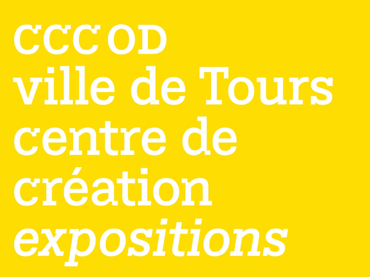
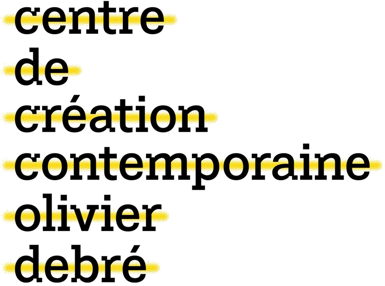
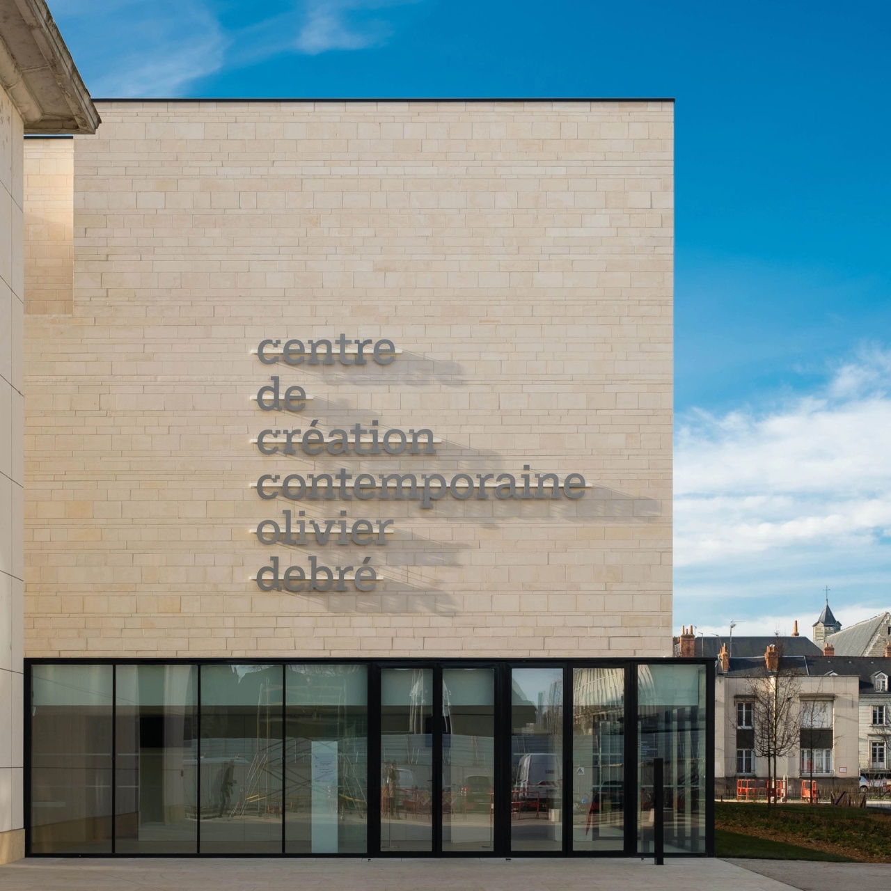
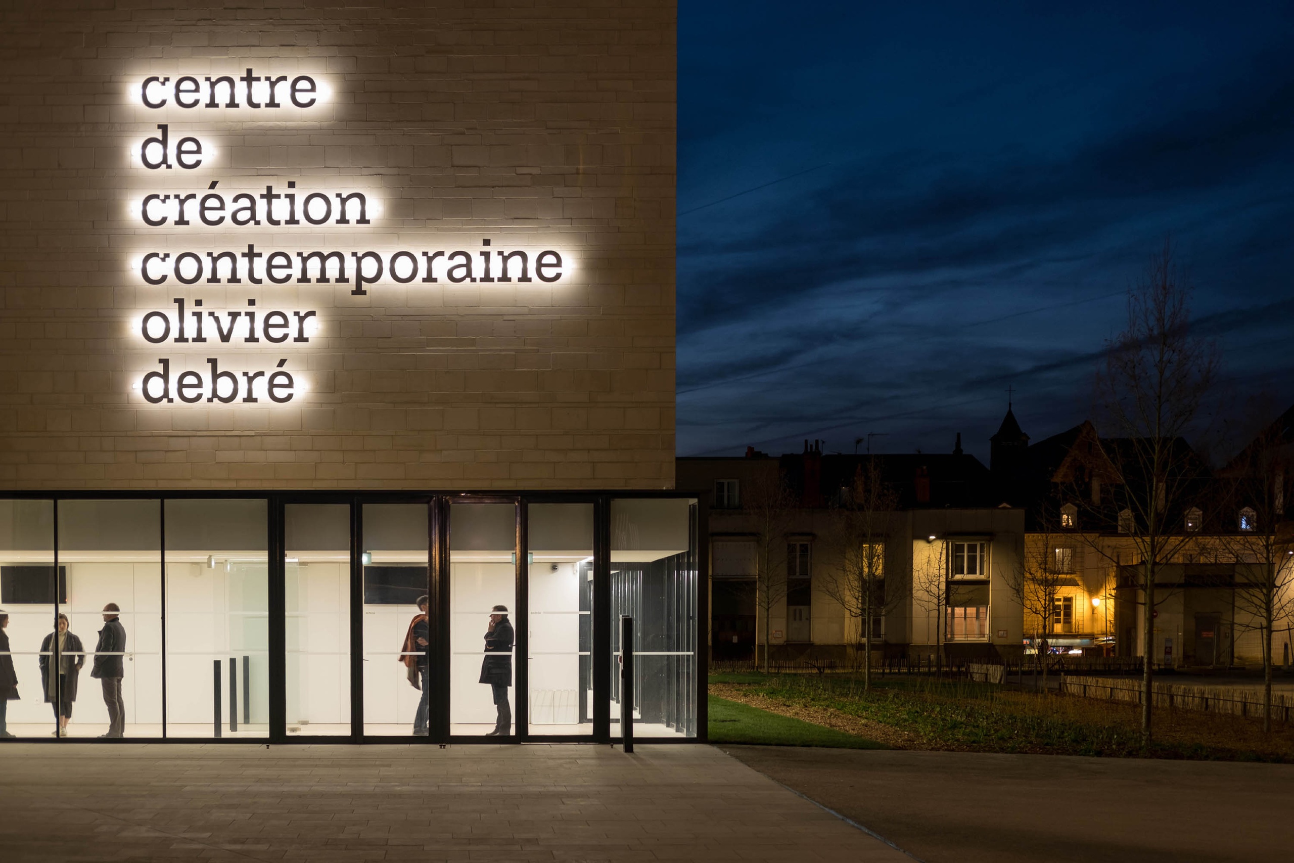
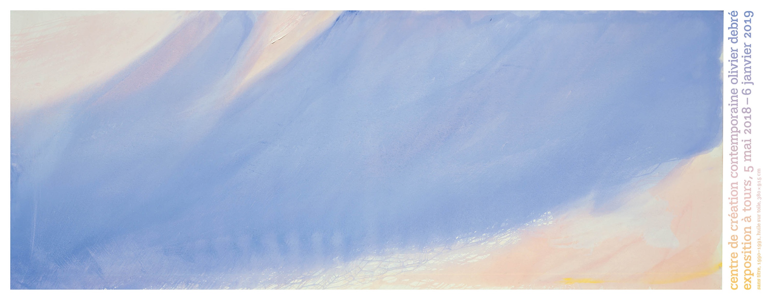
about Centre de Création Contemporaine Olivier Debré

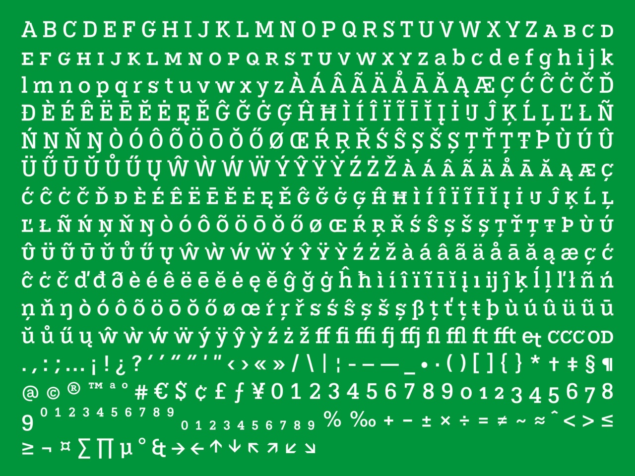
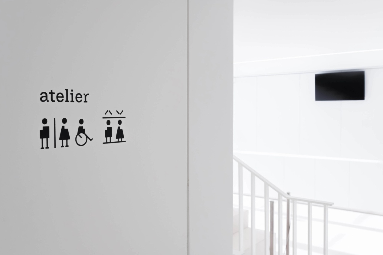
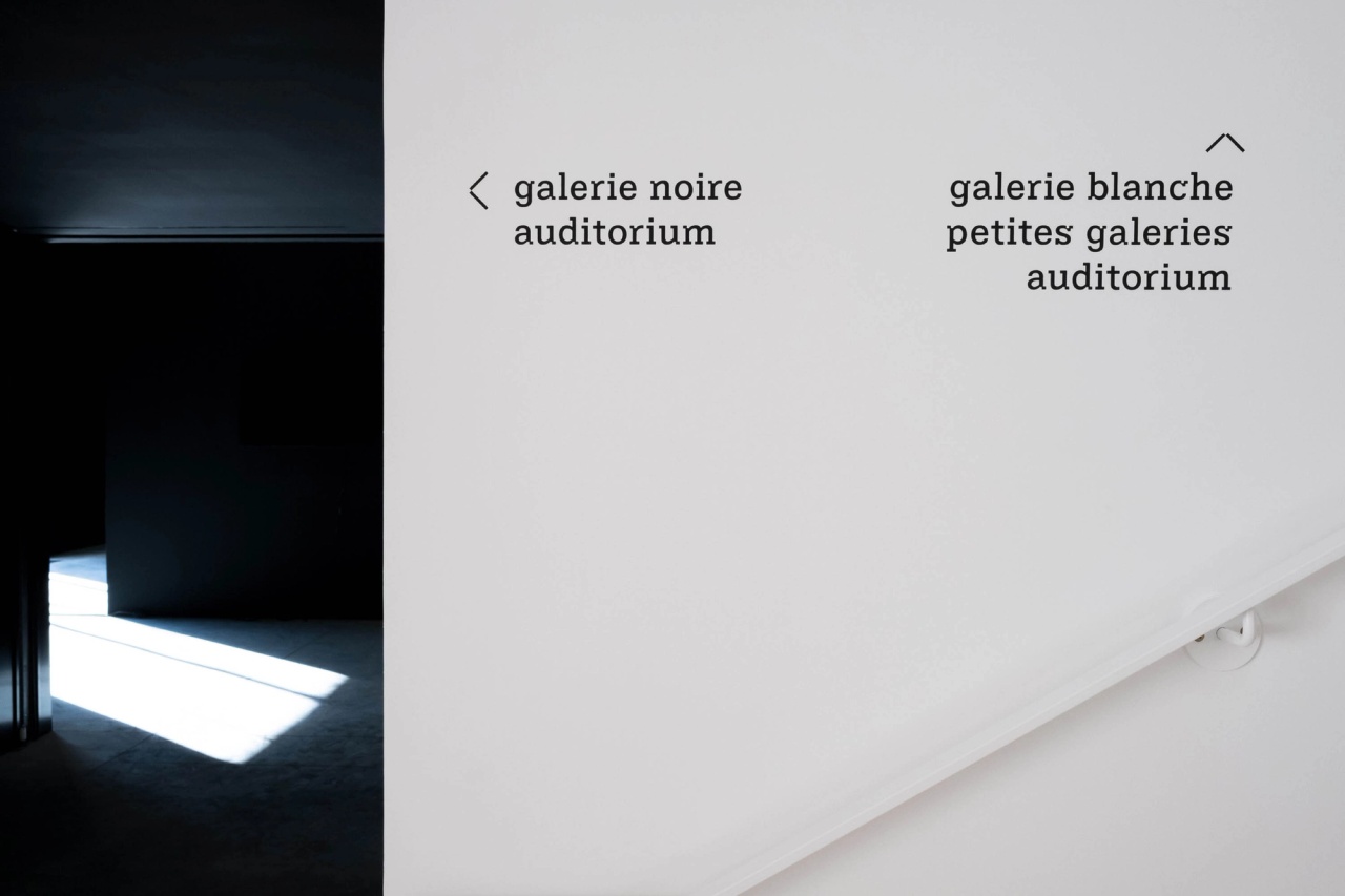
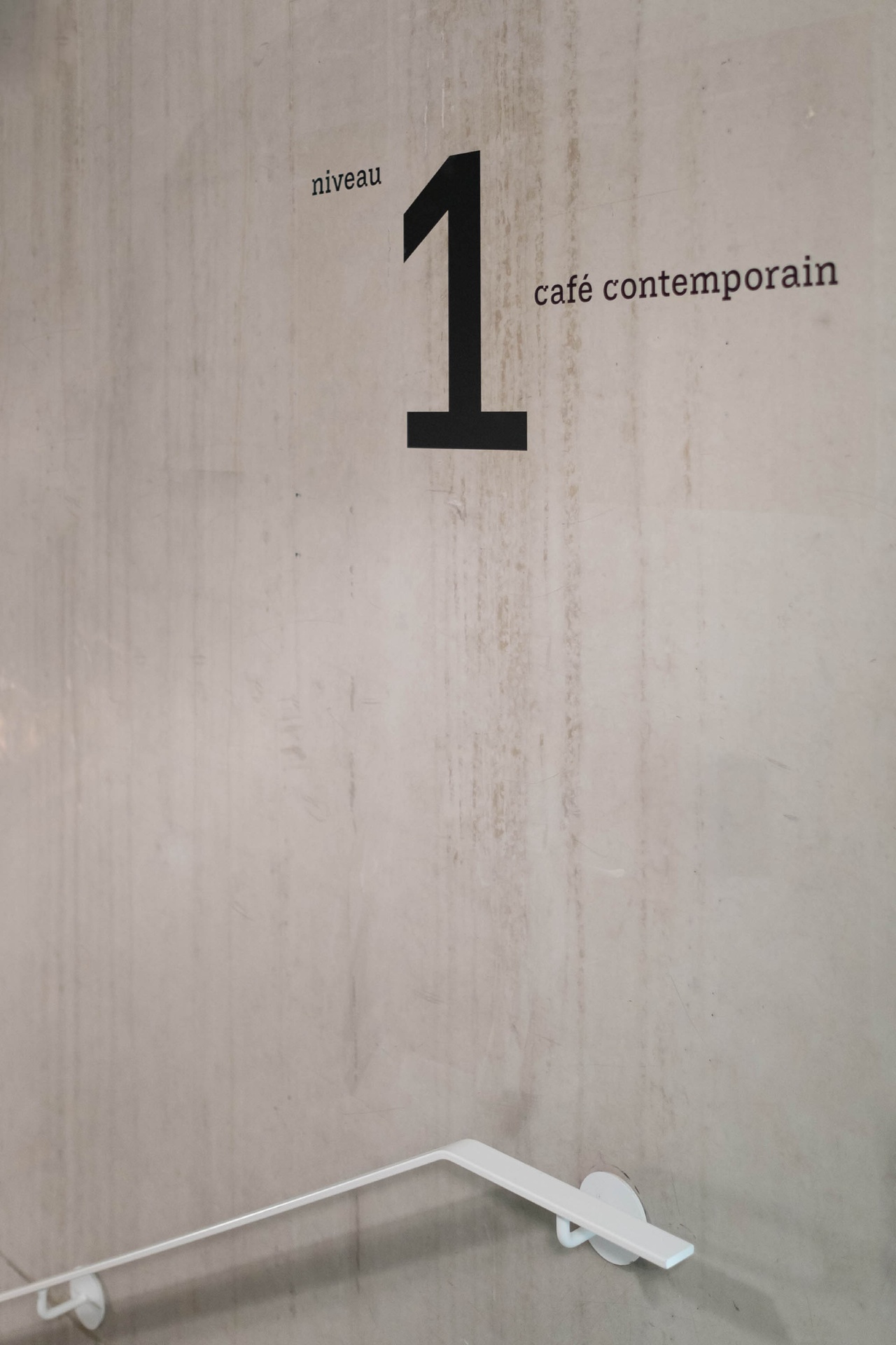
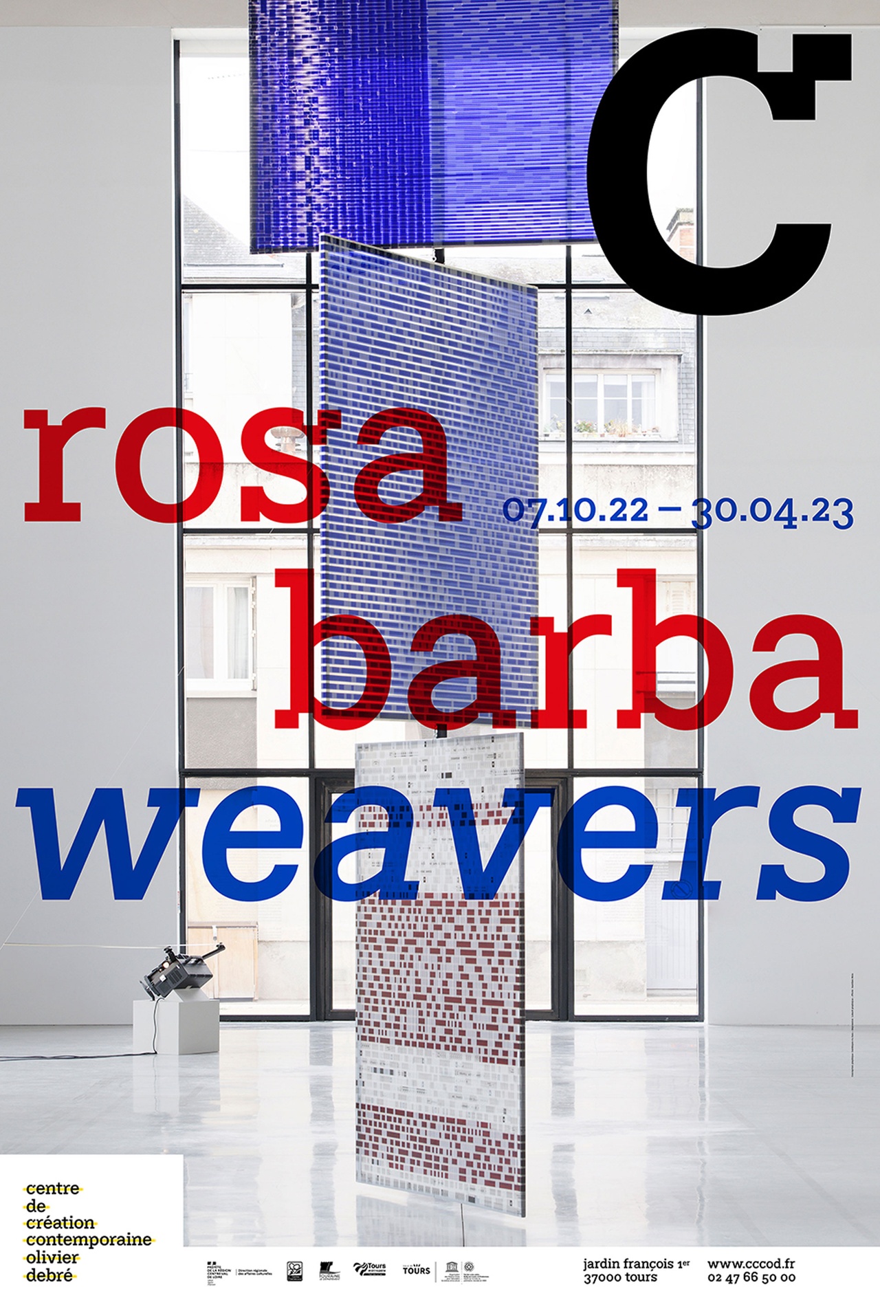
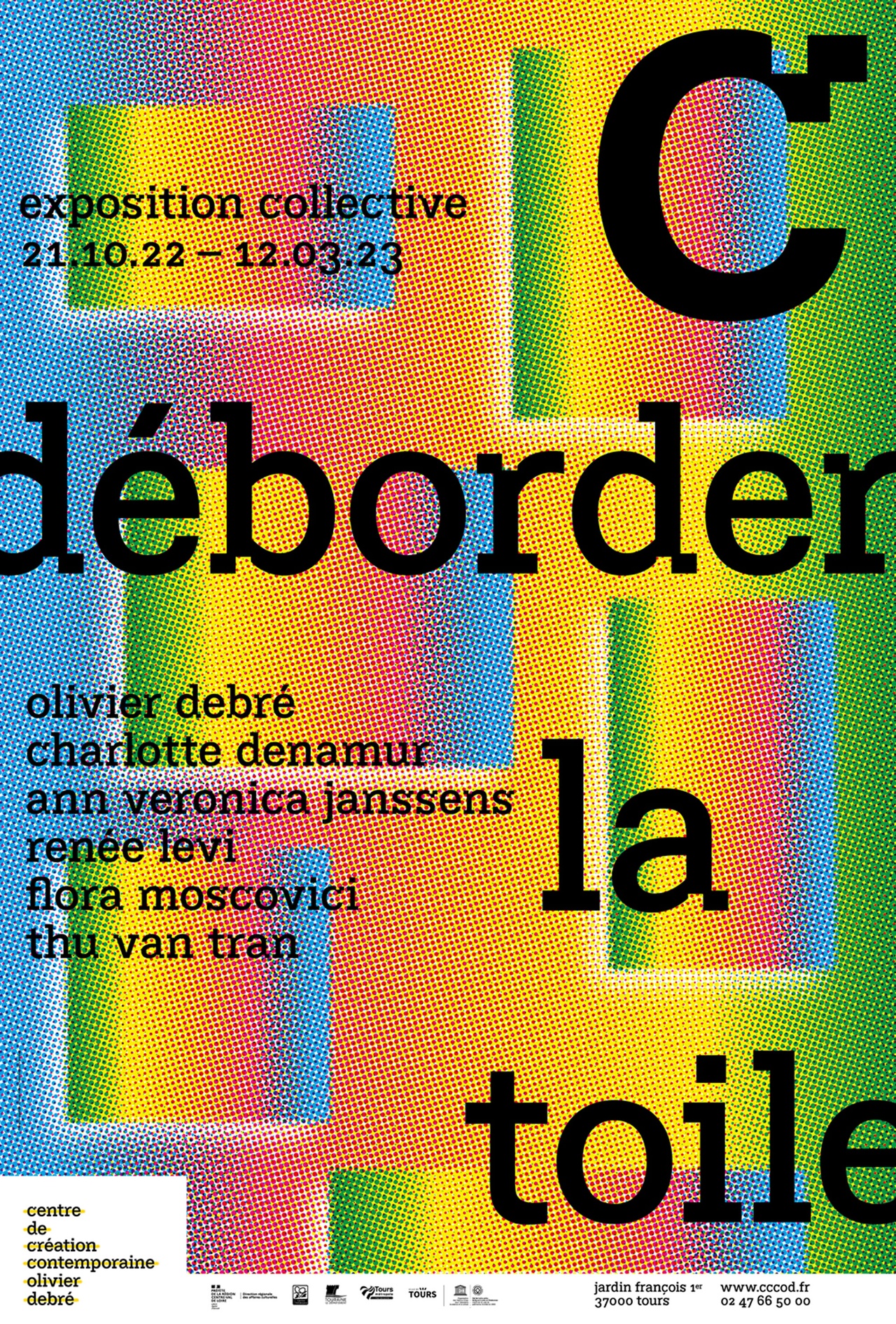
In 2016 the studio baldinger•vu-huu won the competition to create the visual identity and typography of the Centre de création contemporaine Olivier Debré, located in Tours, in the framework of the French 1% artistic contribution.

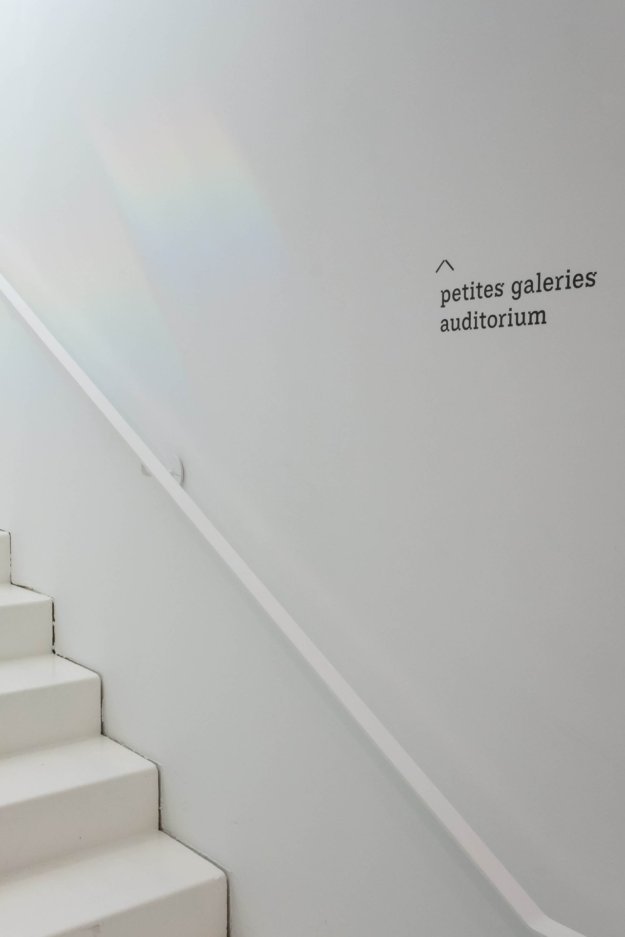
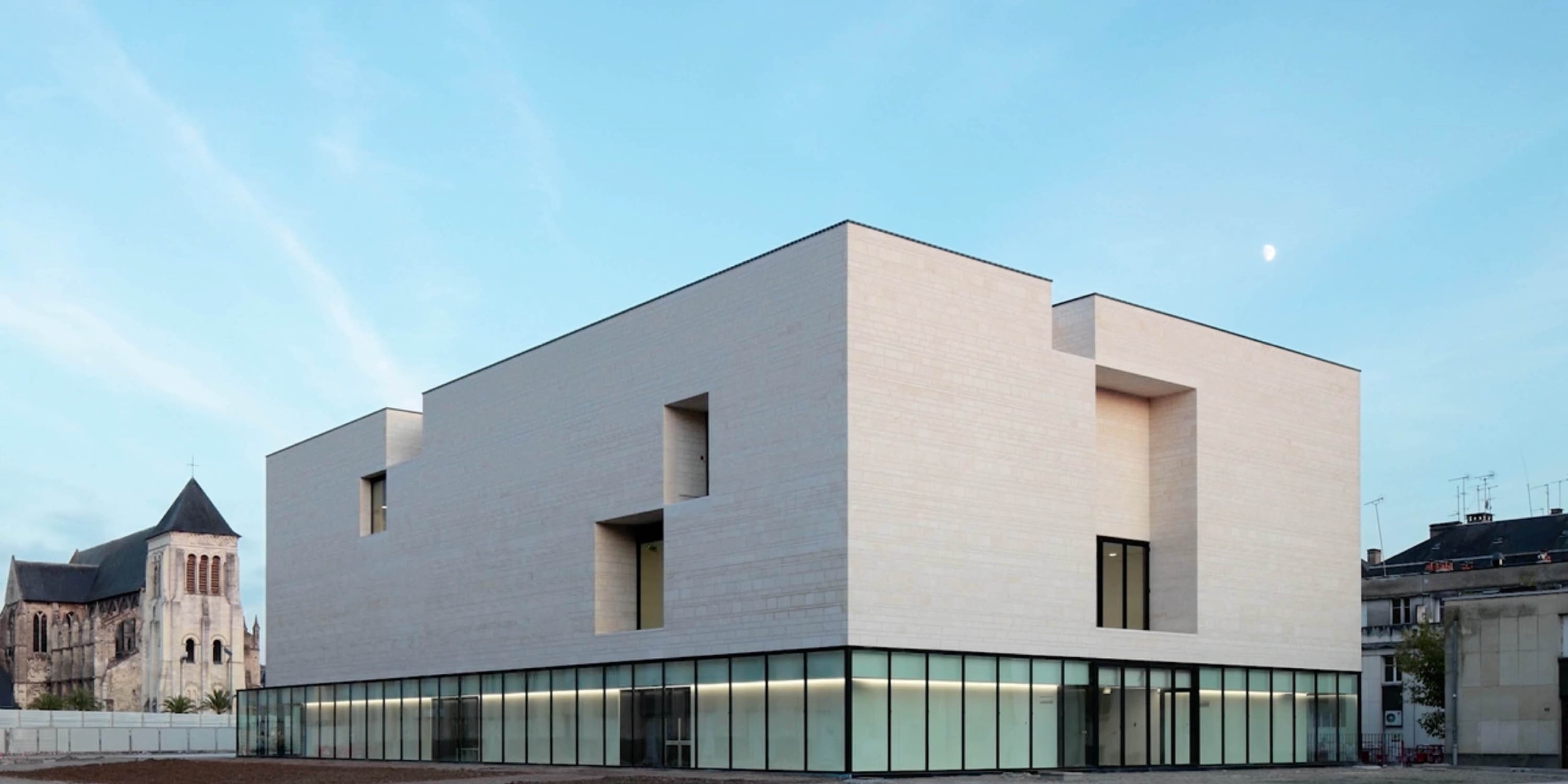
In the heart of the Loire Valley castles region, the CCCOD opened its doors in 2017 and brought to the city of Tours a prestigious creative centre of international standing. The 4,500 m2 building was designed by the architectural firm Aires Mateus. It houses four temporary exhibition spaces, an auditorium, a café-restaurant and a bookshop.

As a place for sharing, living and meeting, the art centre offers the public the possibility of an authentic experience of art: it is in this spirit that the programme occasionally brings together the work of Olivier Debré, a significant figure in 20th-century painting, with the most recent works.

about the font

Within the context of the 1% artistic project, the baldinger•vu-huu studio was commissioned to create a typeface that would support and enhance the entire graphic universe of the CCCOD, from its facade sign to its interior signage. The typeface’s design had to transcribe the rigour and geometric clarity of the building. This specific architecture was designed with the principle of displacement of volumes. The architects removed some matter, moved it around, and created openings becoming light sources in the building. This approach to architecture is very similar to the work of type design: the removed matter defines and shapes the final form, bringing it to light.

This shifting of a black surface creating a white one is the founding principle of the typeface design. The stylistic choice was to work on a slab serif, with rectangular serifs reminiscent of the building blocks. Then the displacement of matter had to be integrated into the typeface design. Like exaggerated ink traps, cubic parts were carved out of the typeface at the junctions with stems or serifs. This mechanical feature becomes a graphic element of the typeface identity associated with the CCCOD. Three typeface versions have been designed: a Titling version, with these shifting blocks of material; a Regular version, the more soberly designed slab serif, and its Italic.

The next step was to create permanent signage and pictograms to guide the Centre’s visitors. The pictograms reflect the formal characteristics of the typeface: a blocky appearance and serif feet.

CCCOD: 3 styles (Titling, Regular, Italic)

credits

client

  • Centre de création contemporaine Olivier Debré (CCCOD)

graphic design

  • baldinger•vu-huu

type design

  • André Baldinger & Toan Vu-Huu

pictogram design

  • Agathe Demay