Cart

about Cité Internationale Universitaire de Paris

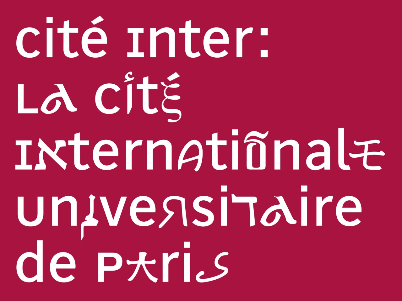
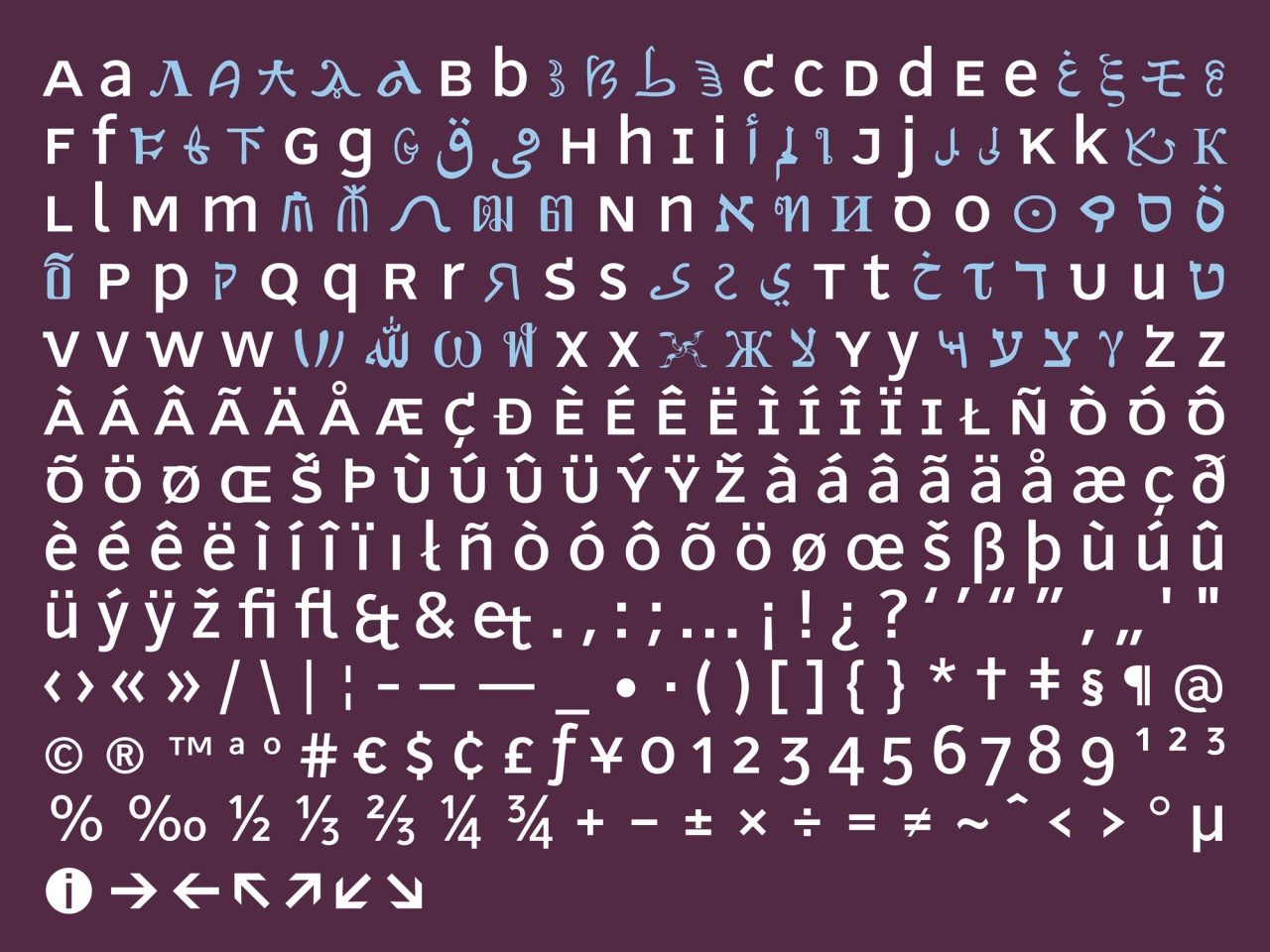
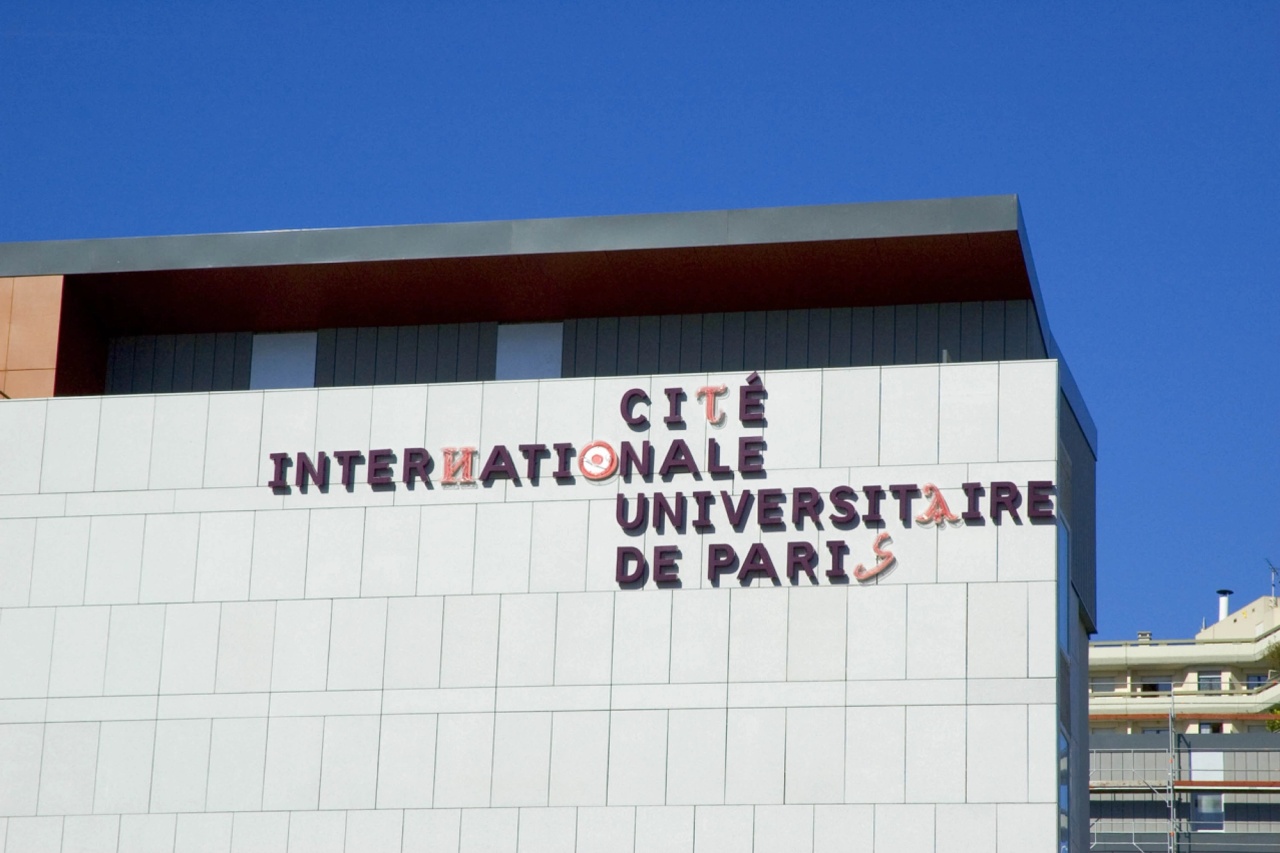
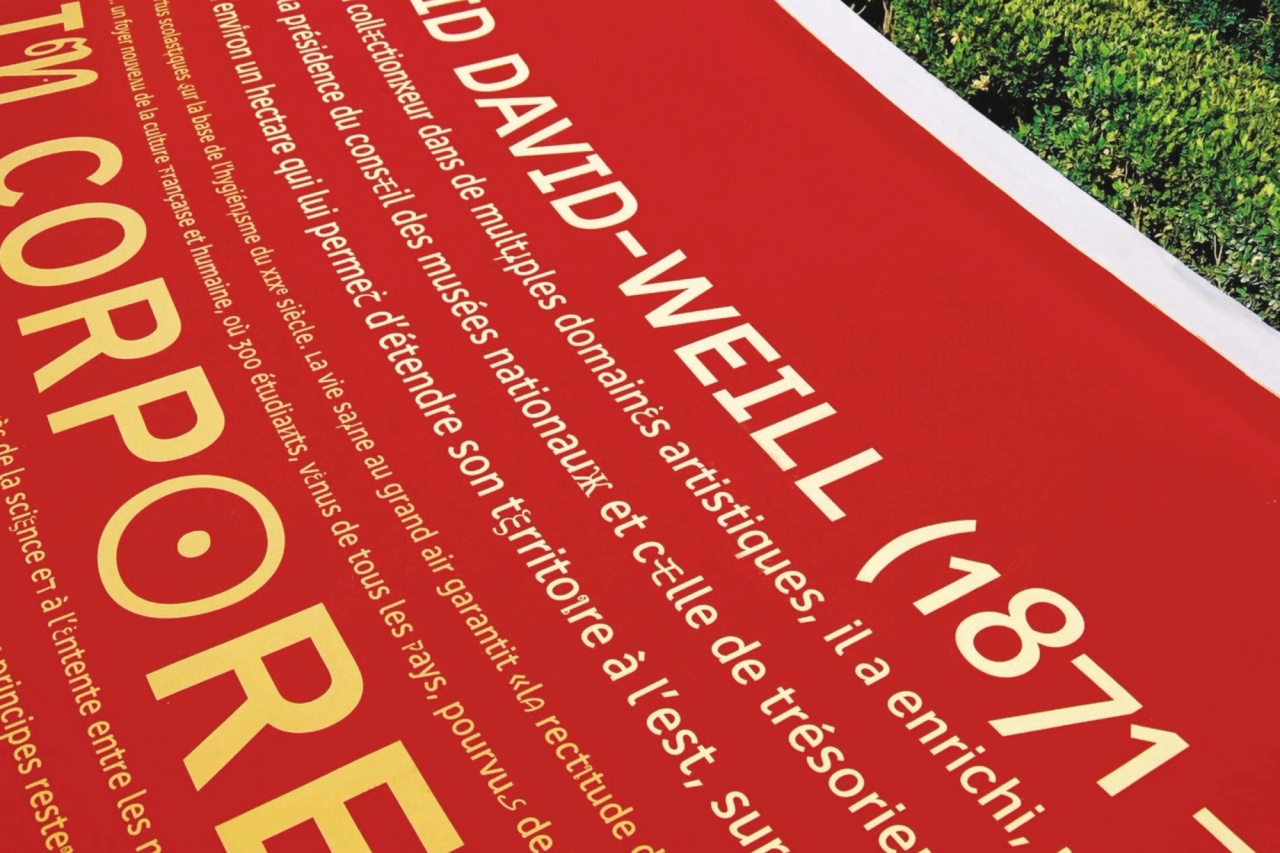
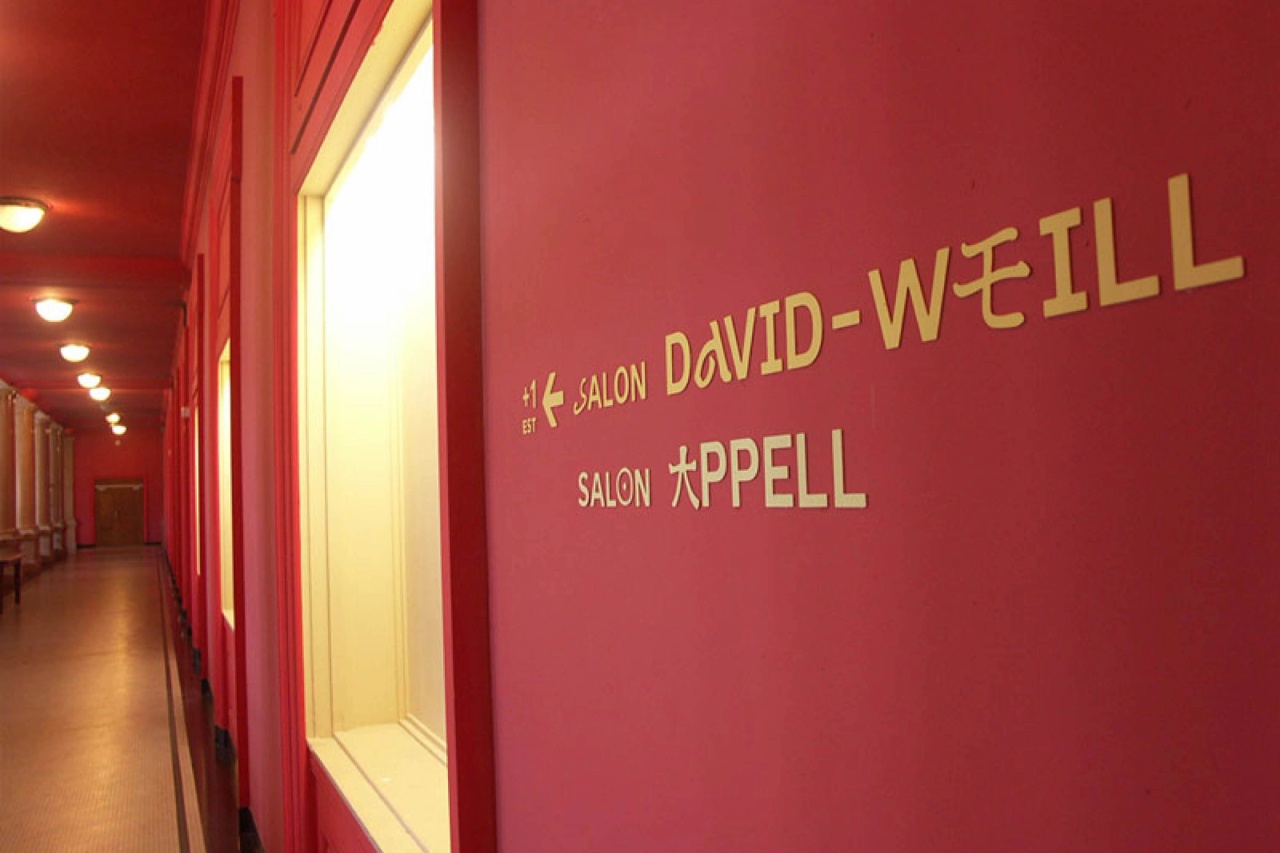
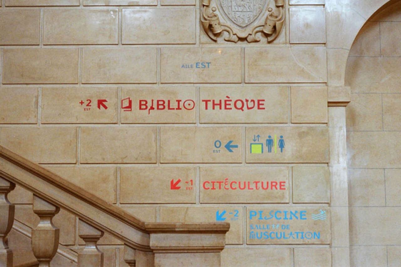
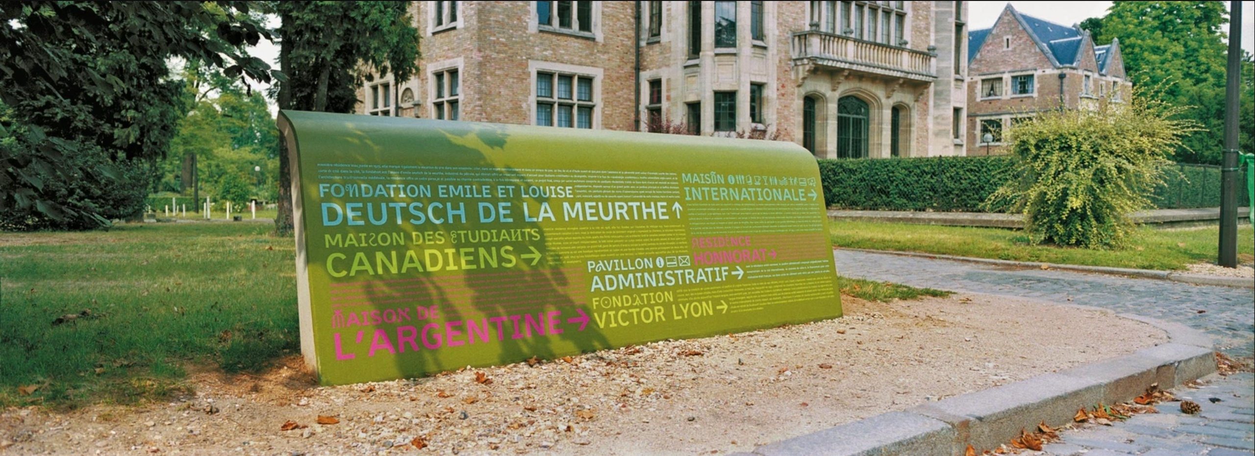
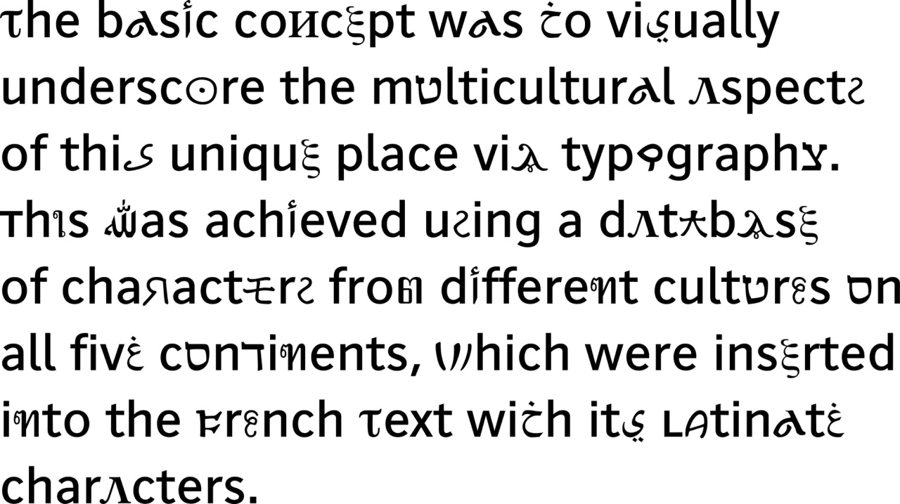
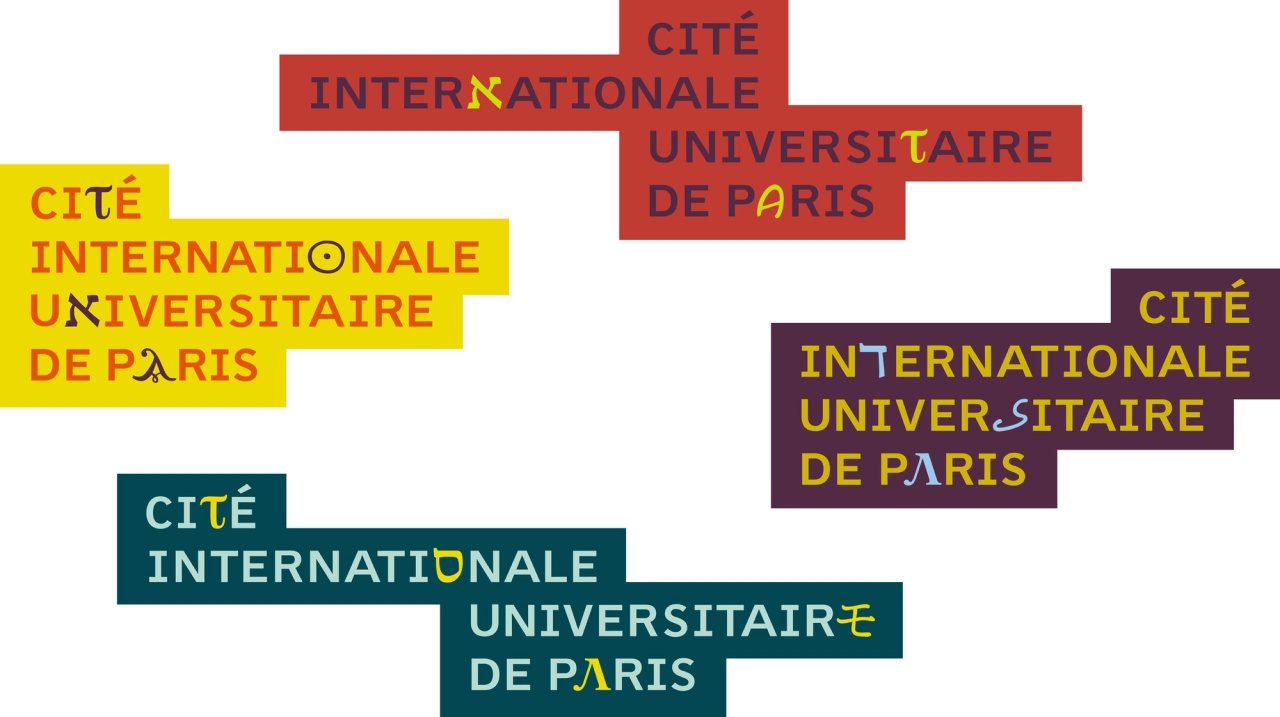
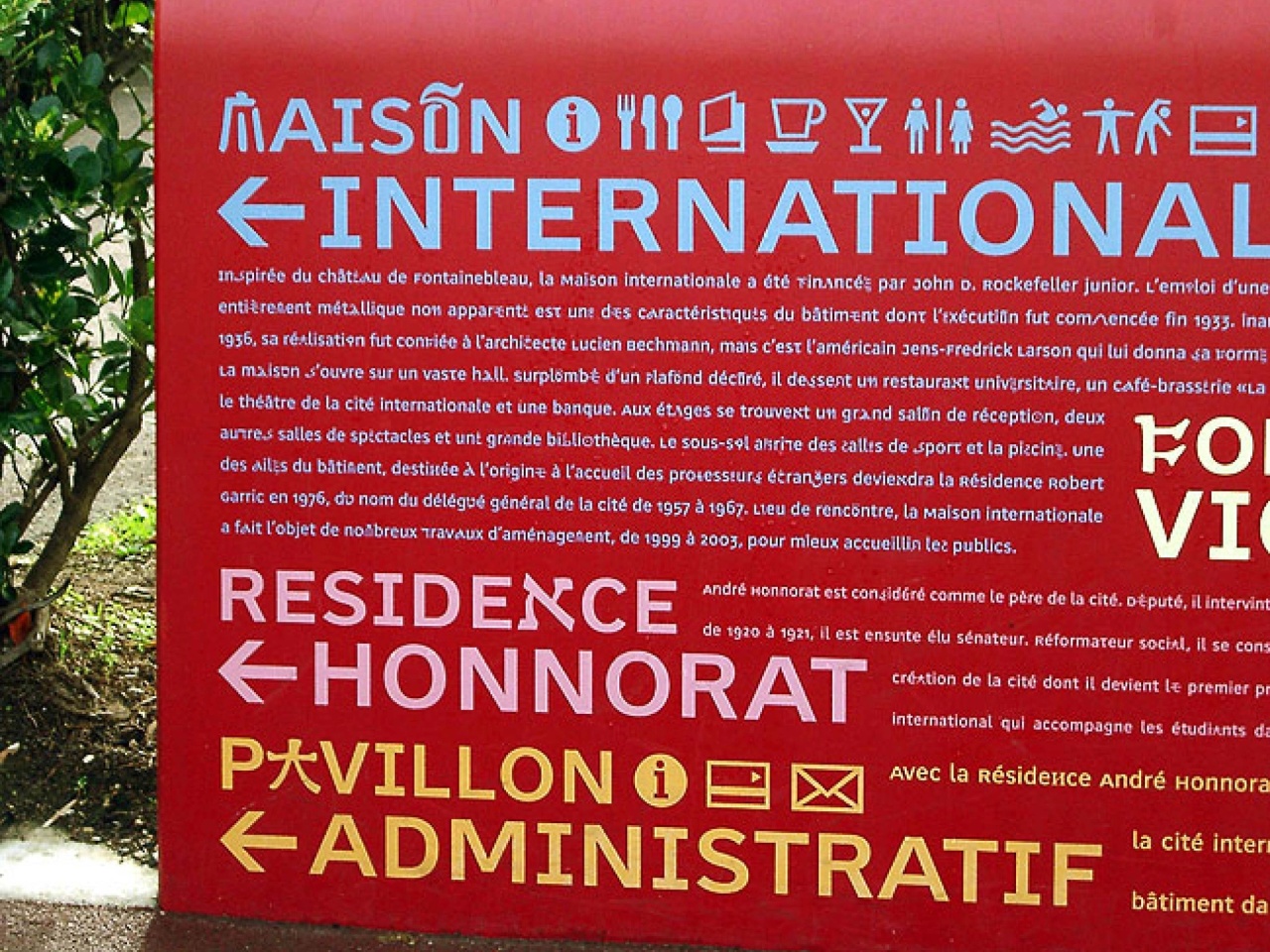
In 2002, André Baldinger worked on a custom typeface adapted to the new visual identity and the signage system designed by Intégral Ruedi Baur Paris for the Cité Internationale Universitaire de Paris, which opened in 2004.

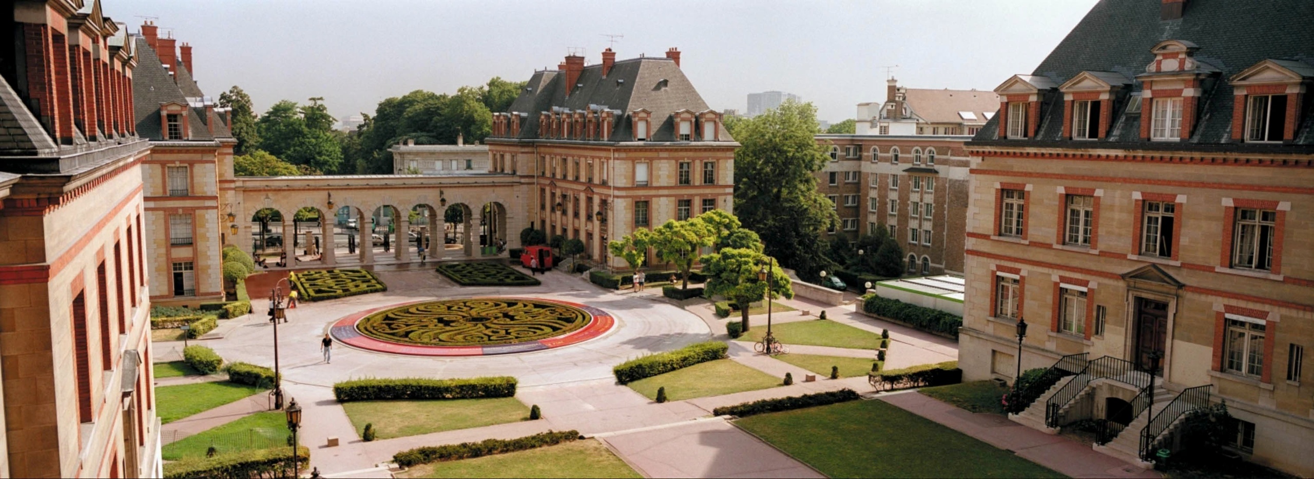
The Cité Internationale was created in the aftermath of the First World War, with the aim of fading borders and allowing students, researchers and artists from all over the world to share their differences in an ideal of peace. This 34-hectare site, with its cultural and sports facilities, is open to the public. It is a place of cultural and architectural diversity that brings together 5,000 residents of more than 130 nationalities in some 40 buildings emblematic of 20th-century architecture. The nature of these buildings is eclectic, with works by Le Corbusier, Dubok and Claude Parent.

Integral Ruedi Baur Paris studio designed this new visual identity and signage with a dual objective: to enhance the value of this architectural and urban heritage and to make the Cité Internationale more accessible to all by orienting and informing students and visitors in this complex and vast site, where buildings alternate with green spaces.

about the font

The project is based on a particular typographic and signage approach that conveys information on orientation and the place’s heritage and history, thus expressing the international dimension of the site. The typeface is a key visual identity element as it actively intervenes in the content. The idea is to underline the unique multicultural character of the place through typography and language by integrating characters from other scripts within the Latin alphabet, punctuating the text.

This custom typeface enables texts typesetted with the Latin alphabet to be enriched randomly with signs from different writing systems. Newut Plain, designed in 2000 by André Baldinger, was used as the primary Latin typeface. The particularity of its design is that its capital height aligns with the x-height. This allows other characters to be integrated and easily mixed with the upper and lower case. After several tests, 57 characters from different scripts were selected. Their formal appearance had to be close to the Latin ones so they could be integrated and read as a Latin alphabet. In the course of the research, it turned out that there were no characters similar enough to certain Latin letters such as C, D, H, L, Q or Z.

Erik van Blokland collaborated on this project, programming the random generator that led to the creation of the “Letterror Mixer” application. This programming enables the random replacement of Latin letters by other scripts within the text. The density of the replacements is configurable, from light to dense, which allows the user to modulate the presence of the different scripts within the Latin, and thus adapt the text to the needs of the signage.

BVH Newut Plain: 3 styles (Light, Medium, Heavy)
Cité Inter: 5 styles (A, B, C, D, E)

credits

client

  • Cité Internationale Universitaire de Paris

signage & identity design

  • Intégral Ruedi Baur Paris & Éric Jourdan

type design

  • André Baldinger

script “Letterror Mixer”

  • Erik van Blokland

photo credits

  • Ruedi Baur, Intégral Paris & Eric Jourdan