about DOC! Espace de production artistique
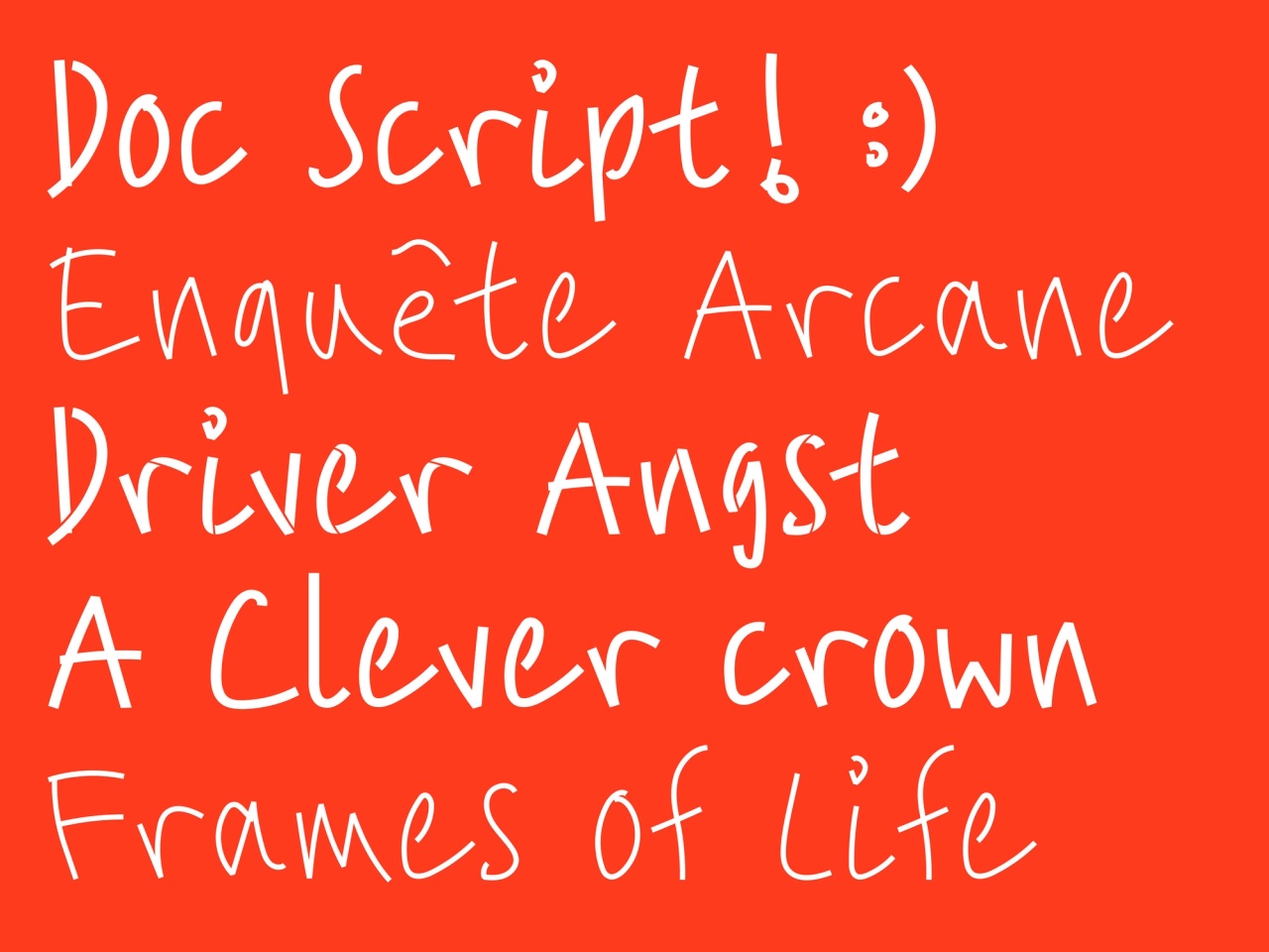
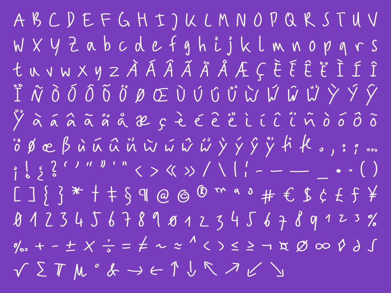
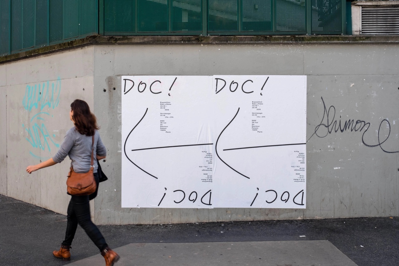
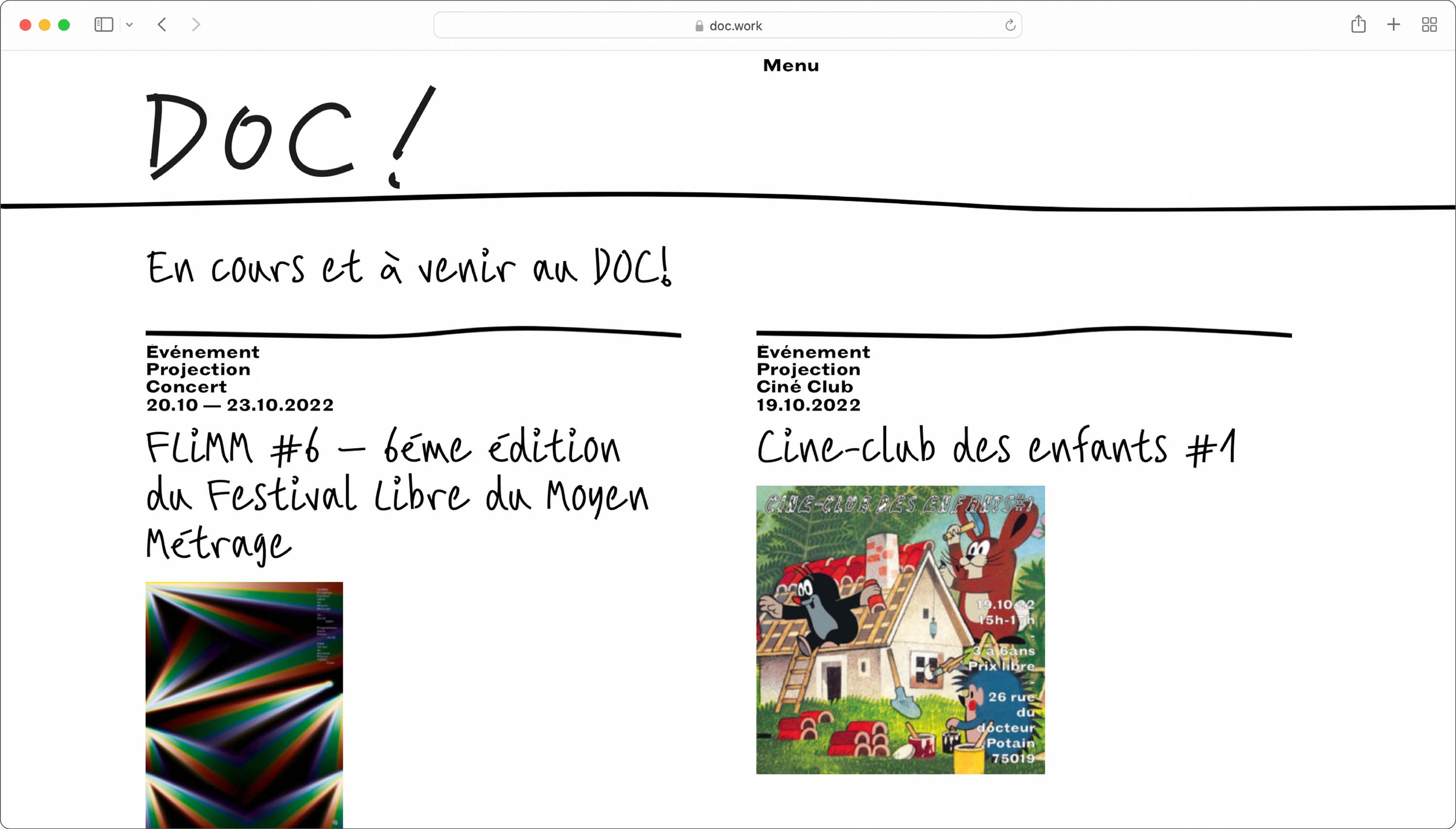
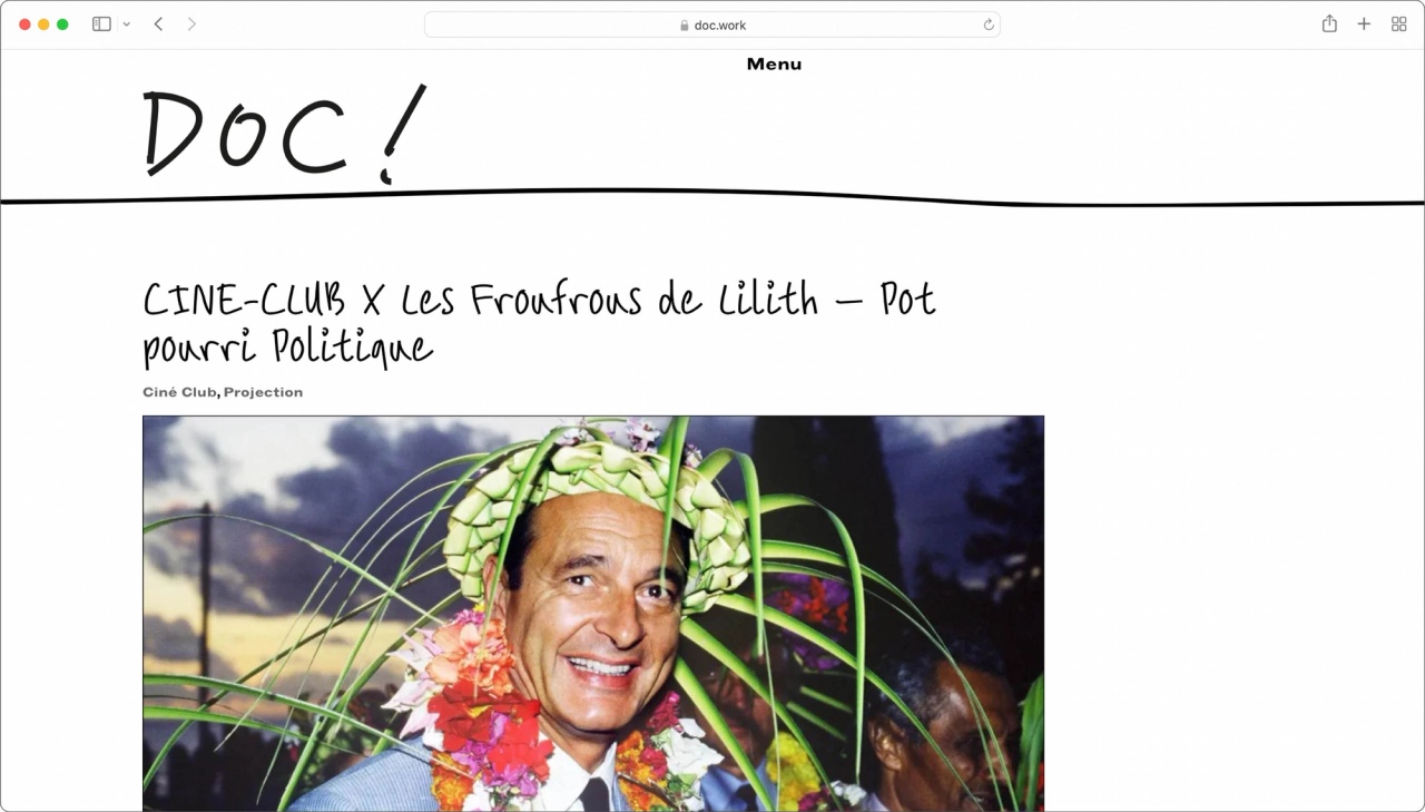
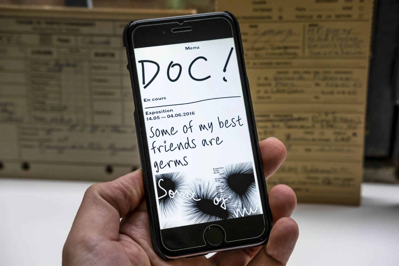
In 2015, Toan Vu-Huu designed a typeface for Doc!, an association and a contemporary cultural place located in the 19th district of Paris.
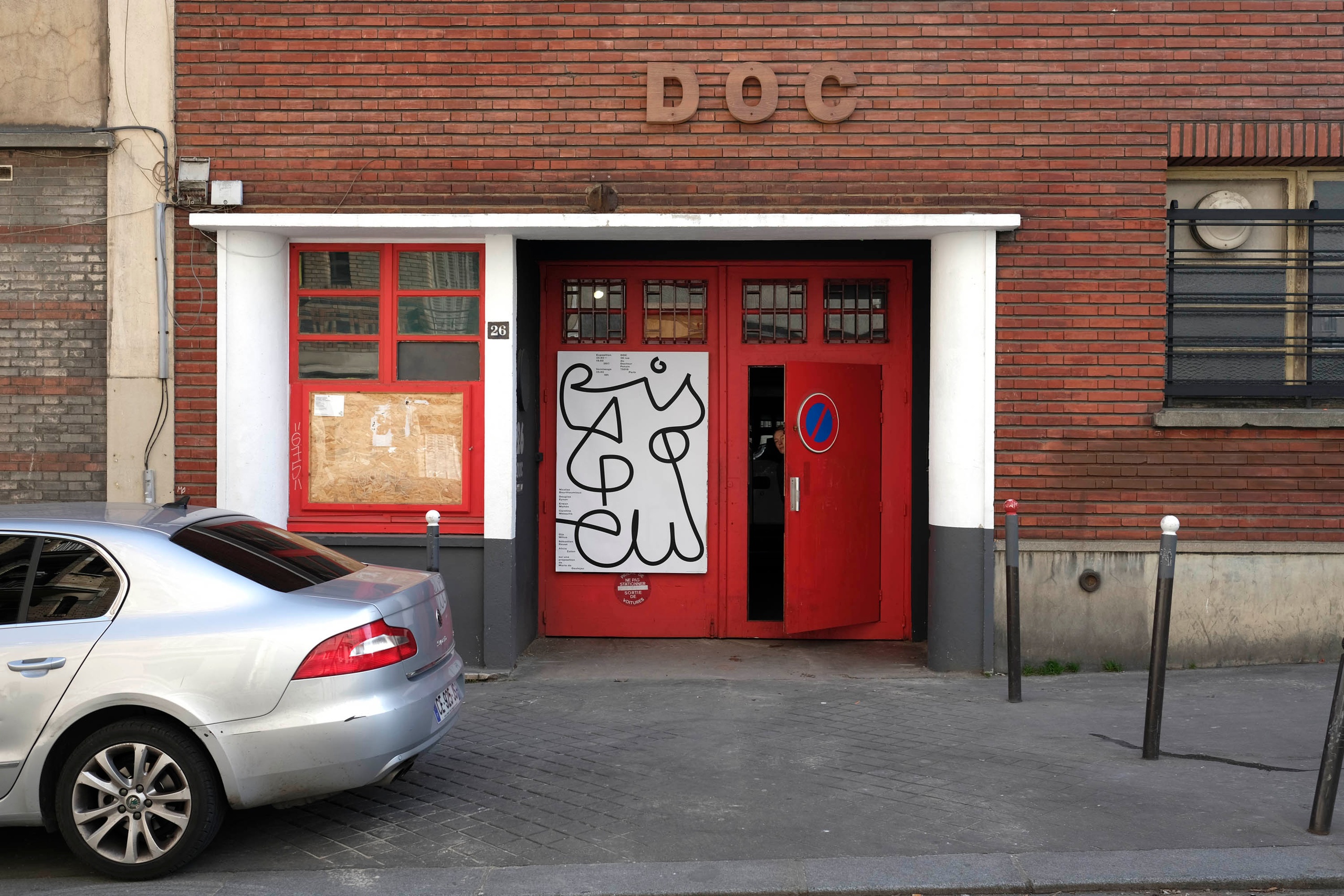
The association Doc! was born in 2015 with the aim of offering production and distribution spaces to contemporary artists. The association allows young or confirmed artists and craftsmen to find a space to work and share in a context where the available ateliers in Paris do not meet the demand. The place, a former technical high school of 3000m2, welcomes artists in private or shared studios and temporary residences. It also has nine specialised workshops open to residents and outside artists: wood, metal, painting, sewing, offset, video post-production, sound and screen printing. Five specialised poles develop the cultural programme: exhibition, concert, performing arts, audiovisual, and free university.
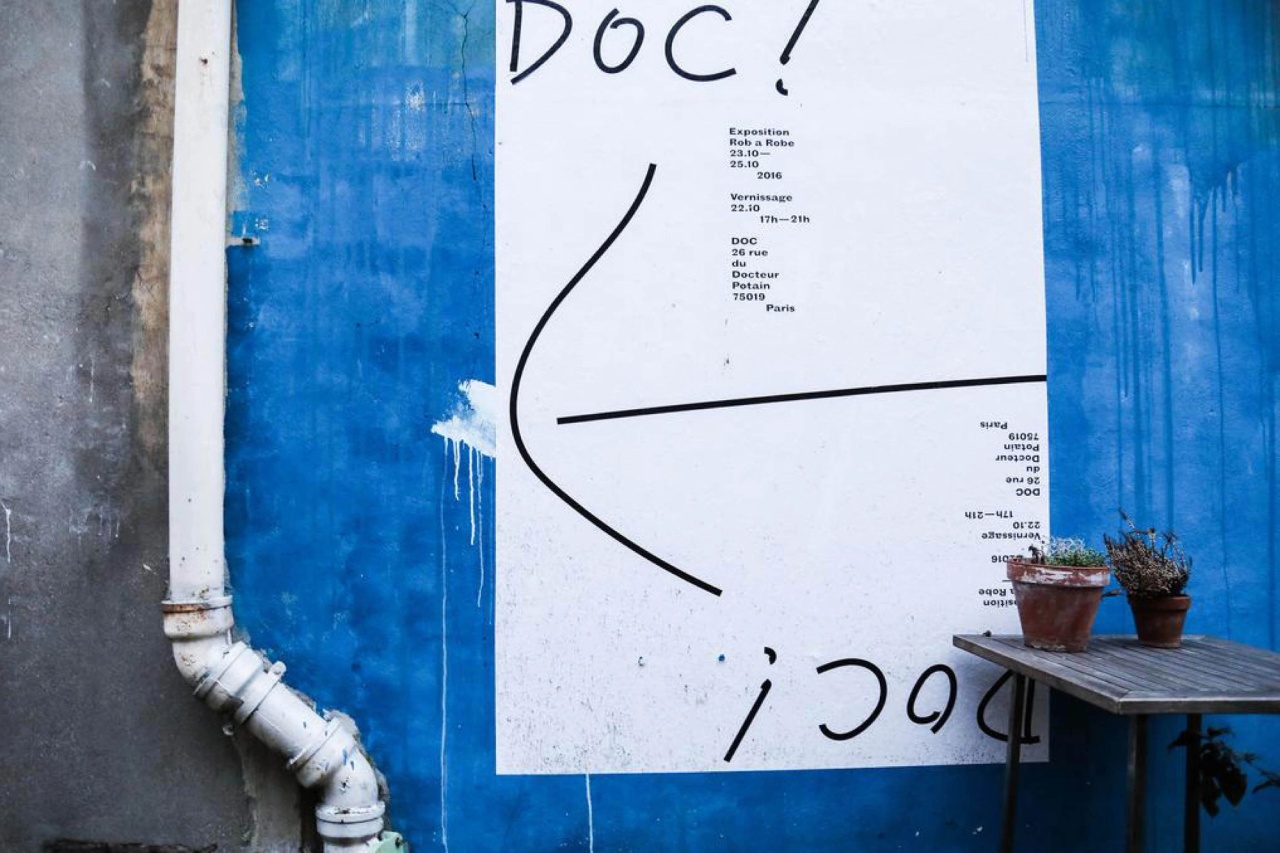
The Doc! thus offers a unique approach to artistic production by encouraging the circulation of knowledge and the emergence of young artists. Doc! actively participates in the life and dynamics of the neighbourhood with a year-round cultural programme of exhibitions, screenings, concerts, theatre performances and meetings.