Cart

about École de design et haute école d’art du Valais

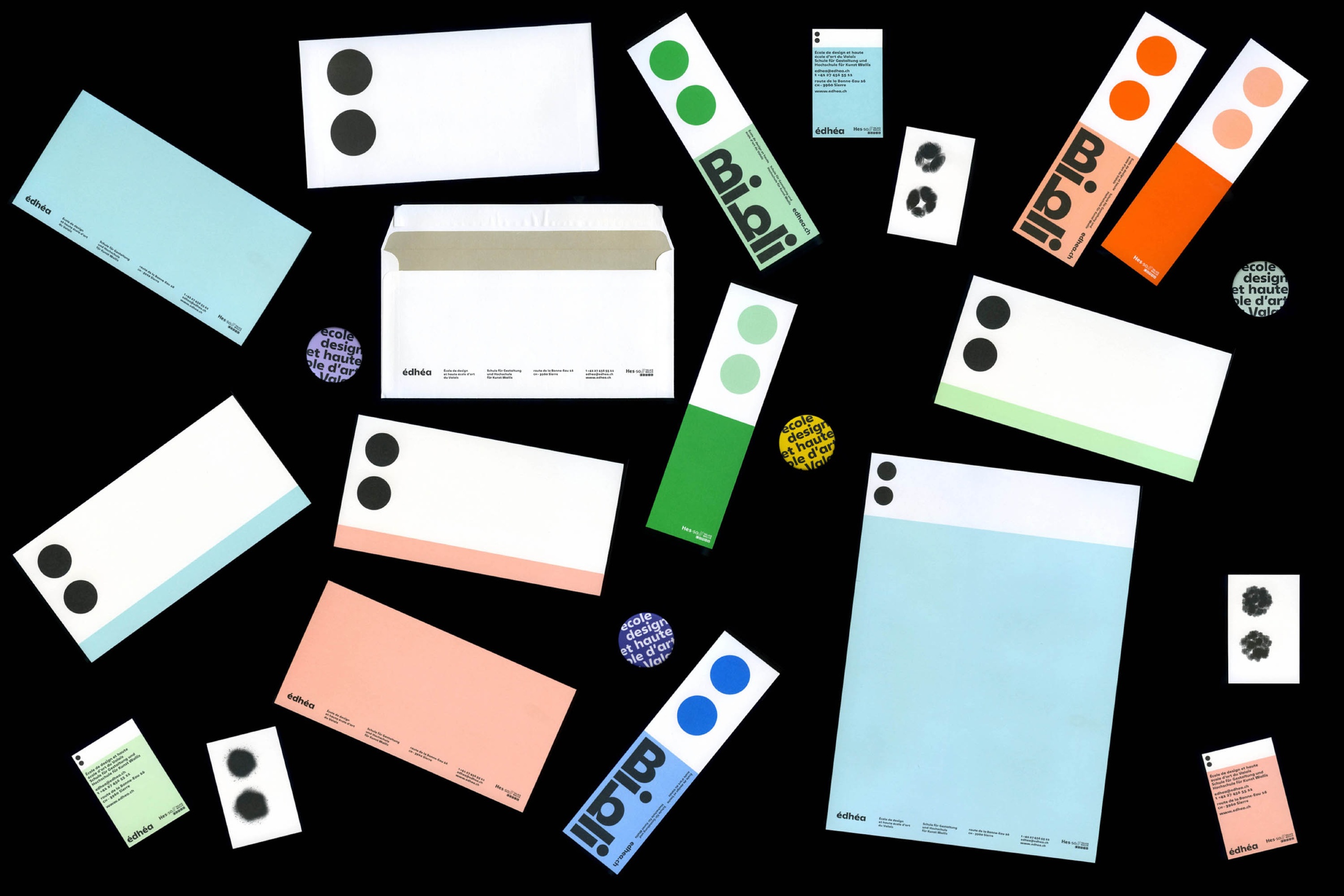
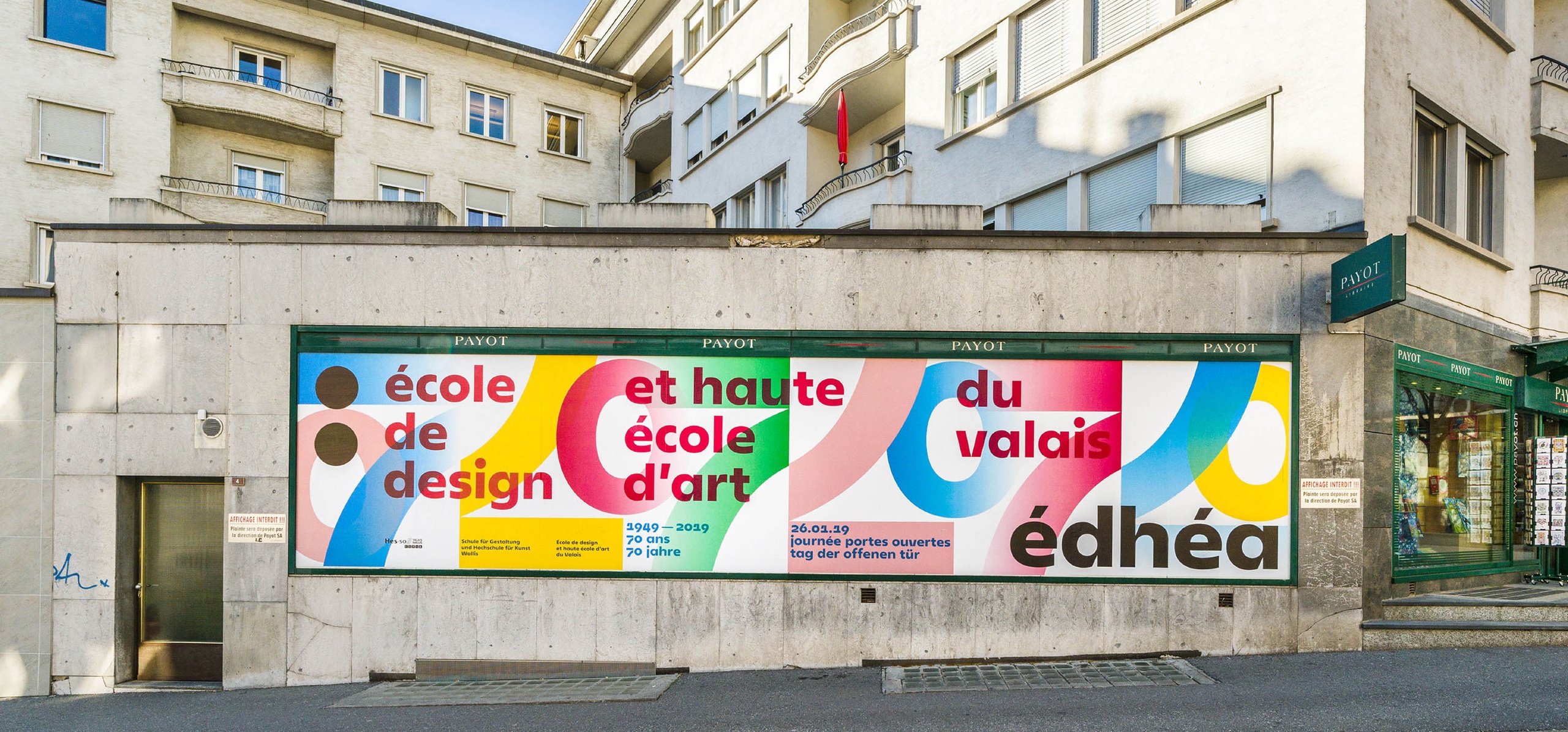
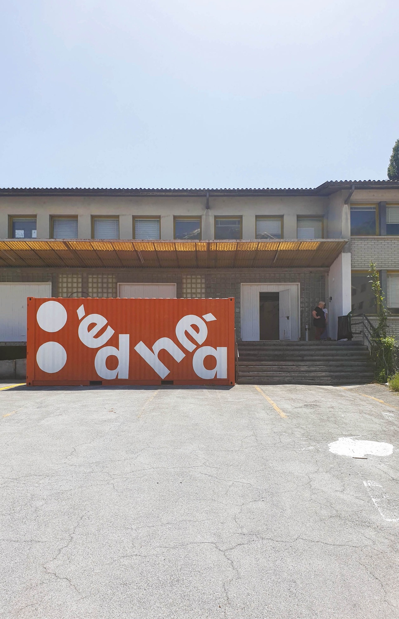
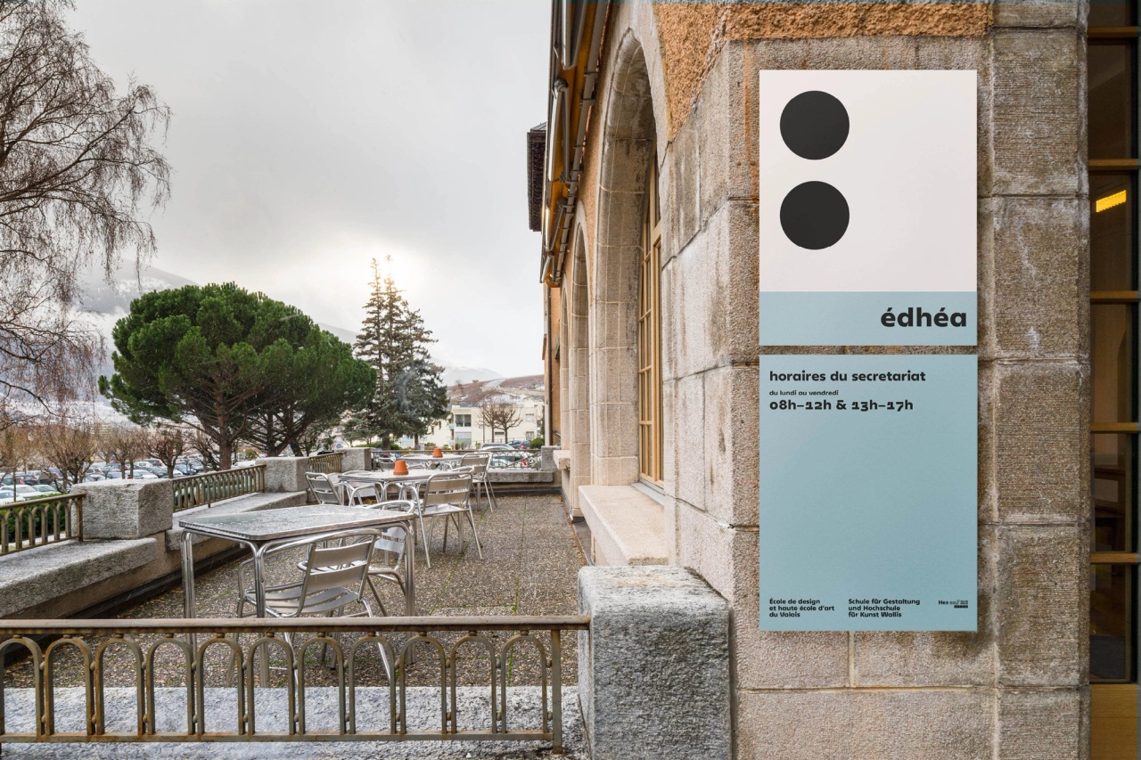
In 2019 the studio baldinger•vu-huu has won the competition for the redesign of the visual identity of the Édhéa, located in Sierre, Switzerland.

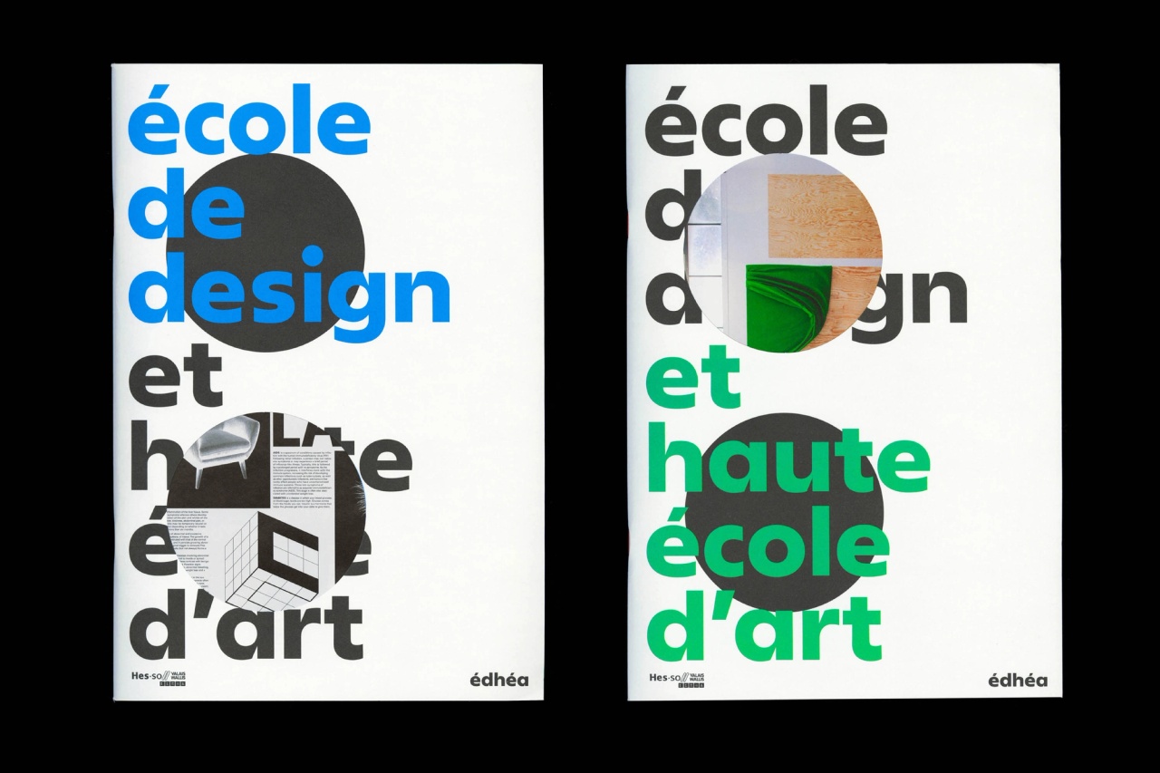
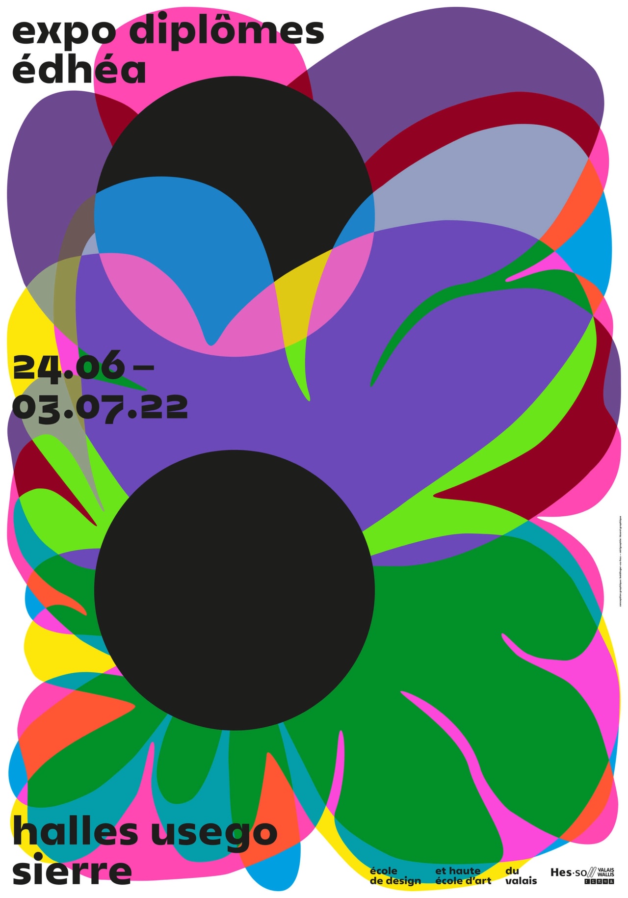
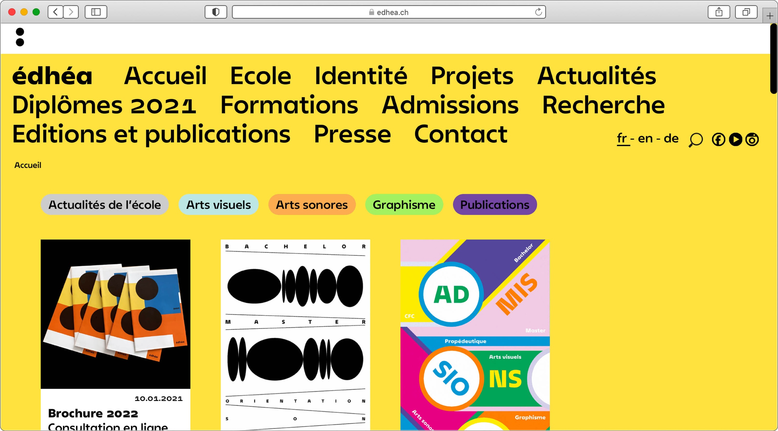
Édhéa is an art school, formerly named the Valais Cantonal School of Art, located in the heart of the Alps in a steep region of French-speaking Switzerland. For its 70th anniversary, the school changed its visual identity and name to école de design et haute école d’art du Valais (Valais School of Design and Art). It is a school that represents the diversity of the arts, with performances, sculptures, paintings, music, photographs, installations and videos; and the diversity of design, with courses in publishing, typography, illustration, posters, signage, visual identity and web design. It has two teaching sections: a school of applied arts, highly specialised in graphic design, and a university of art.

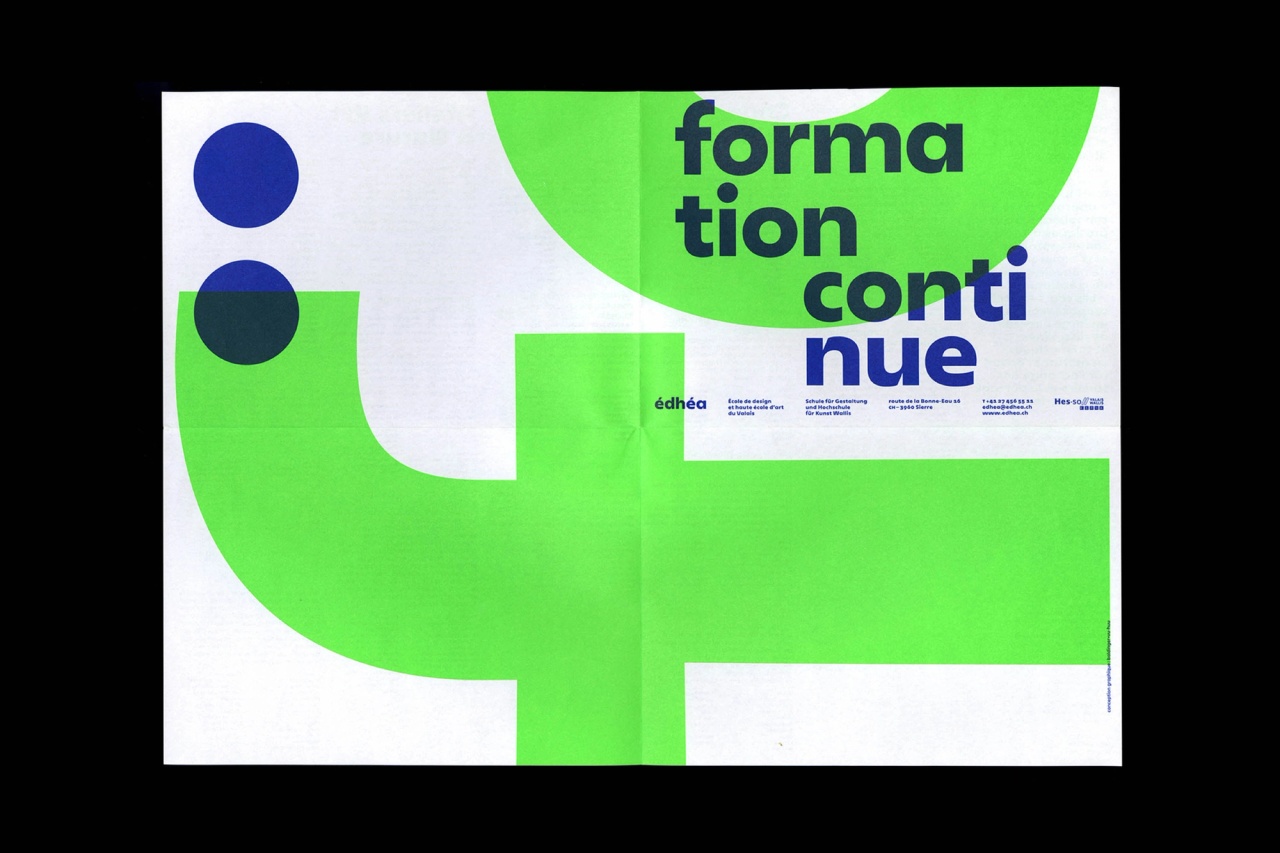
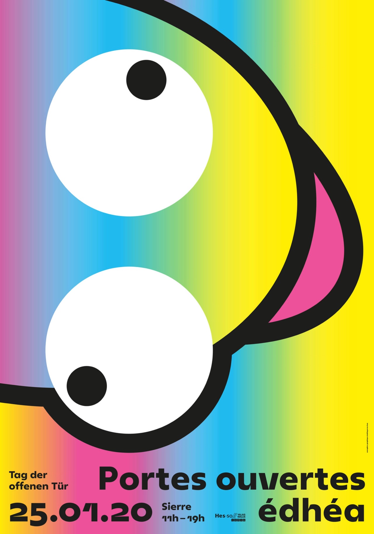
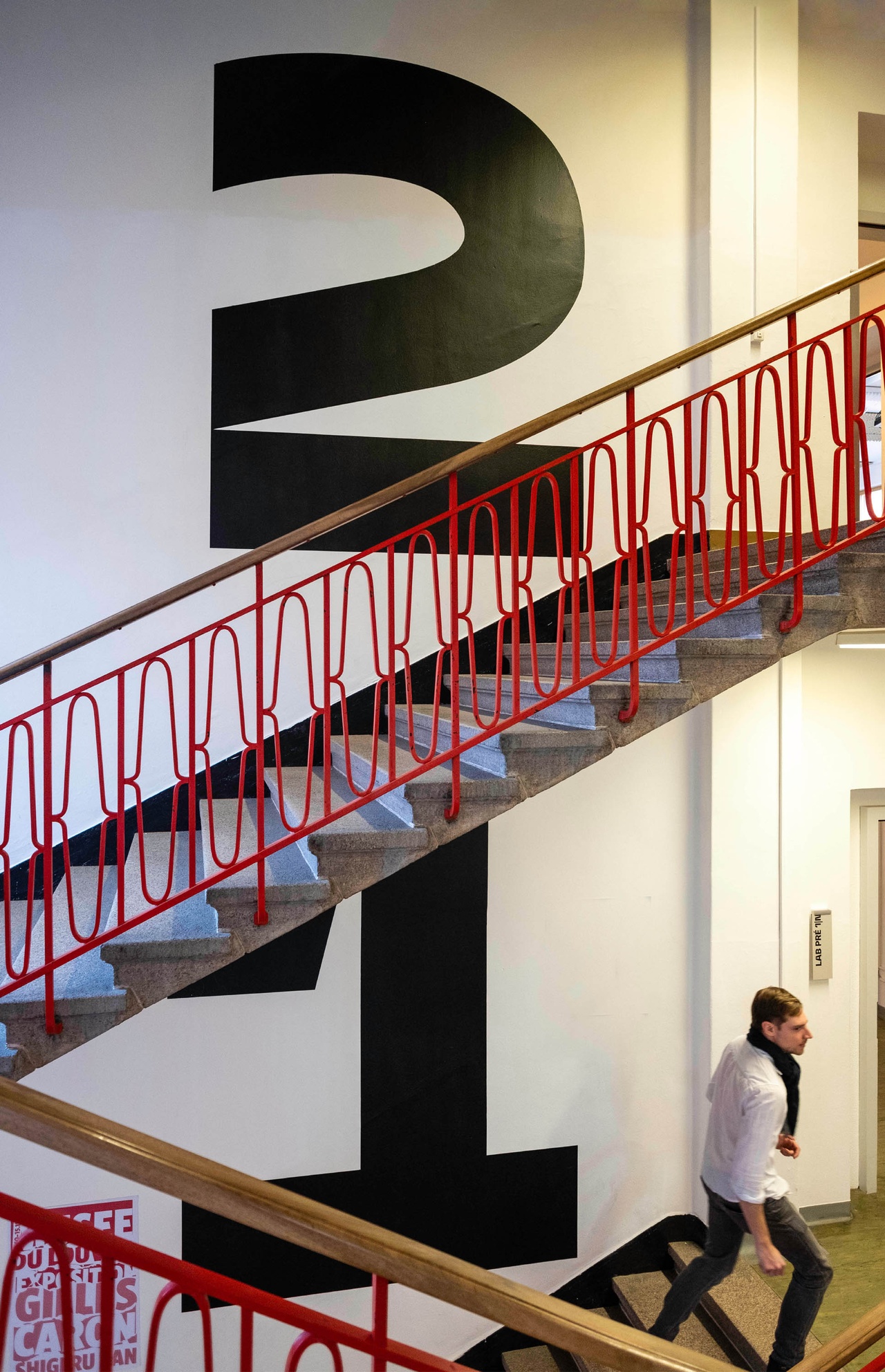
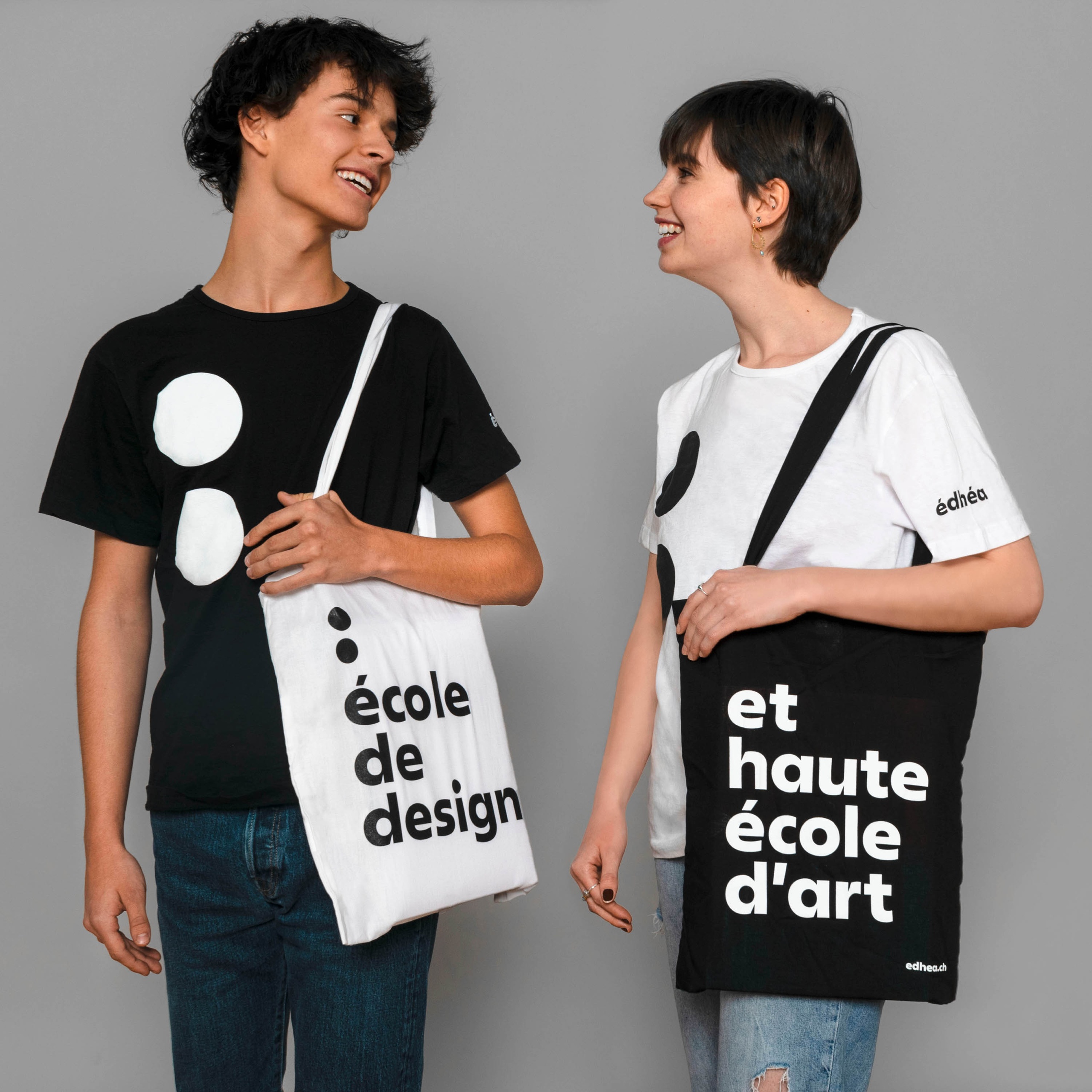
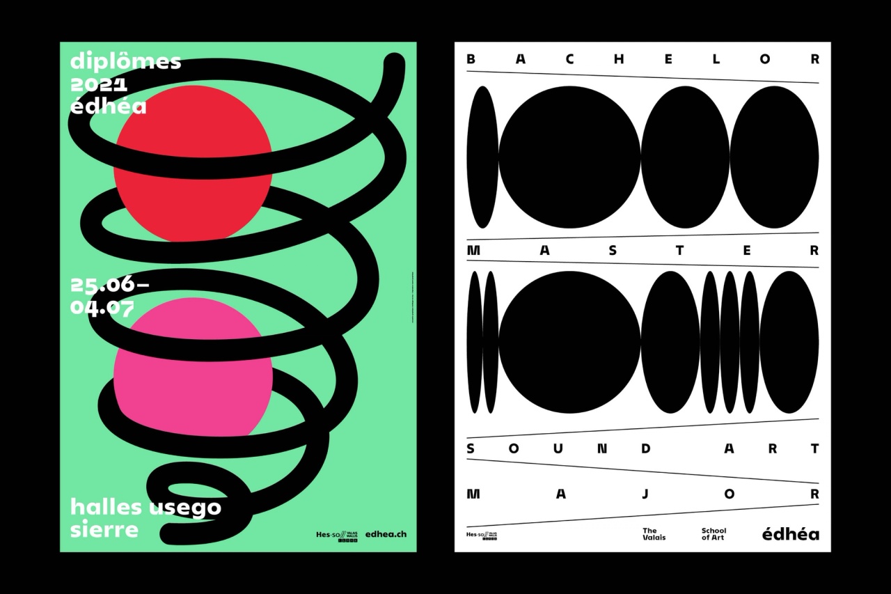
The visual identity developed by baldinger•vu-huu is based on the colon, a double dot. It is a punctuation mark that catches the eye and is used to introduce an explanation, an example, a list or a quotation.

about the font

In parallel with creating the school’s visual identity, b•v-h type developed a custom typeface for this project. Wanting to make the institution recognisable through a distinctive typeface, b•v-h decided to create one in their studio. They were inspired by the principles of the iconic Bauhaus design school. Paul Renner designed Futura in 1927, a typeface that has been extremely popular ever since. Although not directly associated with the Bauhaus, Renner was influenced by its principles and geometric shapes. This classic icon became the starting point for the typeface design for Édhéa. The design is reinterpreted, and its specificities are updated employing current type design software.

Triangle, square, and round forms are the basis of the design. These geometric shapes are then optically corrected to fit the typographic design. To make the character more specific to the project, details from the silhouette of the mountains and valleys that characterise the Swiss landscape were added. The diagonals have been pulled apart to allow the countershape to go deeper into the letter (A, M, N, V, W, X, Y, Z) and materialise the valleys’ hollows. This detail is carried over on the lowercases in another way, with an incision at the stems’ junction. This gives the typeface more personality and increases legibility in small sizes and on digital media. The dots in the i’s and j’s are slightly exaggerated to remind the school’s identity.

Initially designed in 4 styles (Medium, Bold and their italics), the family was then extended to include the b•v-h type retail catalogue.

BVH Eddi: 8 styles (Light, Light Italic, Regular, Italic, Medium, Medium Italic, Heavy, Heavy Italic)

credits

client

  • École de design et haute école d’art du Valais

graphic design

  • baldinger•vu-huu

type design

  • André Baldinger & Toan Vu-Huu
  • assisted by Jimmy Le Guennec